
Choosing between coated and uncoated paper becomes difficult when one Bible includes several content roles. Text pages need comfortable reading and controlled show-through. Maps need clear color, small labels, and fold performance. Inserts may need a different surface again. The paper that looks best in a swatch can behave differently after printing, folding, gathering, and binding.
The uncoated vs coated paper choice starts with how each sheet handles ink. Coated paper usually gives ink a smoother surface and stronger image definition. Uncoated paper absorbs more ink and usually feels warmer and more natural in the hand. Neither category is a complete specification. Choose by page role and physical properties, then check a printed and bound sample.
What Is the Difference Between Coated and Uncoated Paper?
Coated paper has a surface layer that reduces absorption, while uncoated paper leaves the paper fibers more exposed. That surface difference changes ink, images, page feel, and reflected light.
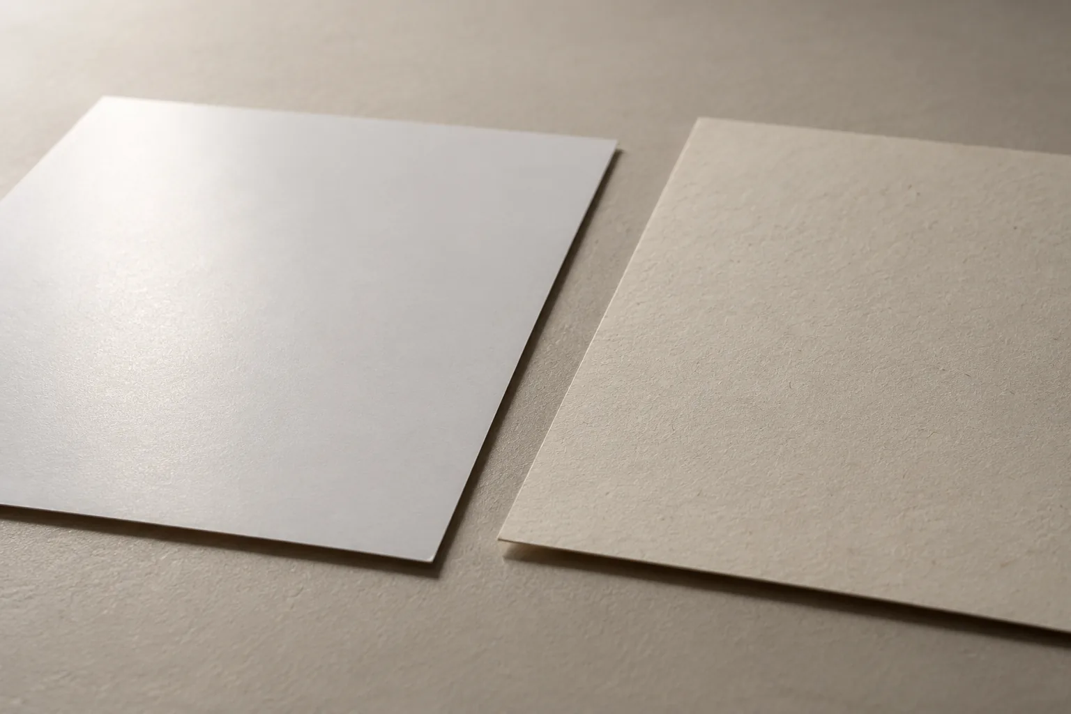
| Paper direction | Typical print behavior | Physical feel | Buyer question |
|---|---|---|---|
| Coated | Ink stays closer to the surface, supporting crisp detail and stronger color | Smooth, with a range from matte to glossy | Will image clarity outweigh glare or a less writable surface? |
| Uncoated | Ink penetrates the fibers more, giving a softer or less saturated result | More tactile, with smooth and textured grades available | Will reading comfort, low glare, or writing matter more than image punch? |
“Coated” also covers different finishes. A matte or silk surface can control reflections better than a gloss surface, but it still has a coating. “Uncoated” covers different levels of smoothness and formation, so one uncoated grade can print much more evenly than another.
For a Bible project, compare more than the coating label. Review opacity, caliper, shade, surface smoothness, ink coverage, page count, and binding requirements together. Kingtai’s Bible paper selection guide explains why paper affects reading, bulk, printability, and binding. Its custom Bible printing page is the next step when those paper questions need to become a physical production brief.
Which Paper Suits Bible Text Pages?
Bible text pages usually need a surface that supports long reading, clear small type, low distraction, and controlled show-through. A smooth uncoated grade can be a useful starting direction because it gives a natural feel and avoids strong reflections, but the final choice still depends on opacity, ink, type, layout, and lighting.
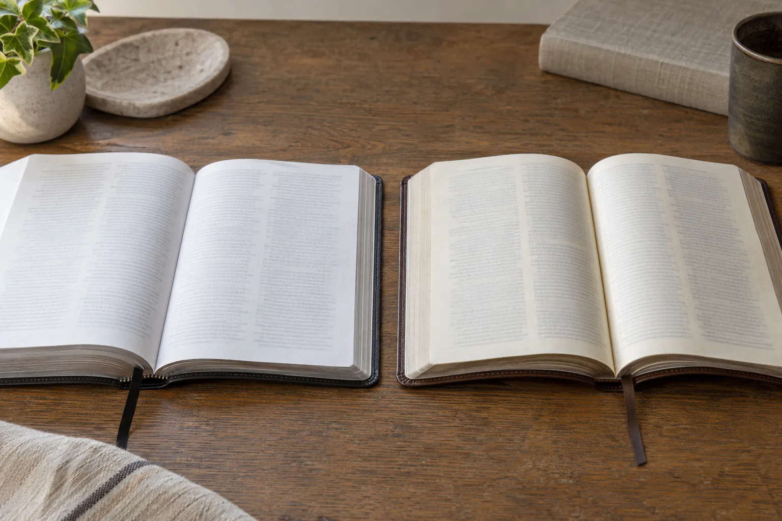
Coated paper can work for text when the selected finish, print density, and lighting produce a comfortable page. A matte surface may reduce reflections compared with gloss, but “matte” does not guarantee that a thin Bible page will be easy to read. A page with strong show-through, dense color, or small reference type can remain tiring on either category.
Check the text section for:
- reverse-side show-through under normal reading light;
- glare when the page is held at a typical reading angle;
- sharpness of the smallest type and footnotes;
- ink density in black text and rules;
- page turning, drape, and resistance to handling; and
- the relationship between paper thickness, page count, and finished spine.
Do not select a paper by looking at a blank swatch alone. Print a representative spread with the actual type, line spacing, notes, and darkest planned pages. A paper that feels attractive in isolation can make a dense Bible layout look gray or force a later change to the page plan.
When Does Coated Paper Help Bible Maps?
Coated paper can help a Bible map when the map depends on fine lines, small labels, color separation, or a controlled image surface. Because the coating limits absorption, it generally keeps printed detail and color edges more defined than a comparable porous sheet.
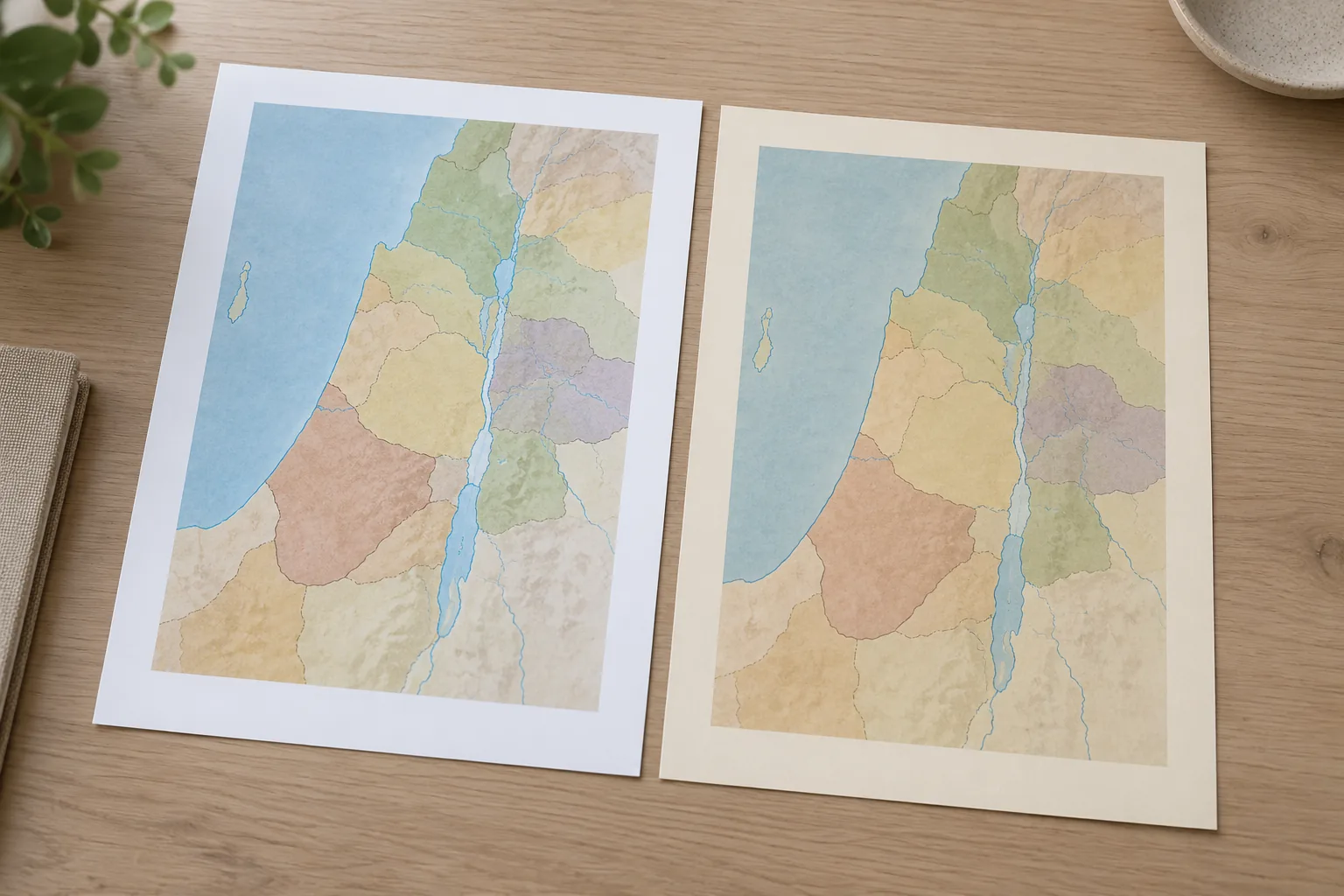
That benefit has conditions. Gloss surfaces can reflect sanctuary, classroom, or desk lighting and make a map harder to inspect. A matte or silk coated option may be a better direction when the buyer needs image clarity without a strong shine. Heavy ink coverage can also change how the printed sheet folds and how the map feels next to text pages.
Ask the designer and printer to identify the map’s hardest details before paper approval:
- Fine boundary lines and symbols.
- Small place names and legends.
- Similar colors that must remain distinct.
- Dark areas that cross a fold or trim edge.
- The viewing light and angle expected in use.
If a map is folded into a Bible, image reproduction is only part of the decision. Test the fold, grain, score, attachment, and repeated opening. A vivid map that cracks or catches on the binding is not finished; include these file and finishing questions in the custom printing services brief.
When Does Uncoated Paper Help Inserts and Reference Pages?
Uncoated paper can suit an insert when the content is mainly text, the reader values a low-glare surface, or the insert needs a more writable and tactile feel. This can apply to study notes, concordance pages, reading plans, forms, or reference matter where image saturation is secondary.
Uncoated does not mean low quality. A smooth, well-formed grade can give small text a calm surface and consistent reading experience. It will usually absorb more ink than coated stock, so color maps, photographs, and heavy solids may look softer or less even. If the insert combines text and color, compare the layout rather than the category name.
| Insert content | Paper direction to test | Main trade-off |
|---|---|---|
| Text-heavy notes or reference lists | Smooth uncoated or a low-glare alternative | Comfortable reading versus softer color and image detail |
| Full-color map or chart | Matte or silk coated, plus an uncoated alternative if glare is a concern | Detail and color separation versus surface reflection and fold behavior |
| Reader worksheets or writable pages | Uncoated | Handwriting performance versus ink spread and less vivid color |
| Mixed text and image insert | Compare both on the actual layout | One surface may favor the text while the other favors the image |
The content role should decide the test. Kingtai’s Scripture publishing solutions context is useful when the edition’s reading, teaching, distribution, and presentation goals need to be translated into a physical paper brief.
Should a Bible Use One Paper or Mixed Stocks?
A single paper direction simplifies production, while mixed stocks let a publisher optimize text pages, maps, and inserts separately. Mixed stocks add decisions around section order, color proofing, gathering, bulk, and binding.
| Production direction | Strength | Risk to control |
|---|---|---|
| One stock throughout | Consistent feel, color expectation, and page handling | The chosen surface may compromise either dense text or image-heavy sections |
| Uncoated text with coated map section | Text can favor low glare while maps favor detail | Section thickness, fold, color match, and attachment need review |
| Coated text with uncoated reference section | Image-rich pages can use a sharp surface while notes feel more natural | The change in page feel and ink appearance must be intentional |
| Separate folded insert | A map can use a format and paper chosen for its own role | Fold, hinge, gathering, packing, and repeated opening need proof |
If you choose mixed stocks, identify every section in the pagination plan. State which paper each section uses, where it starts and ends, how it is gathered, and how it connects to the binding. Changing stock can change finished bulk even when page count stays the same. Added inserts or required blank pages must also be reflected in the production pagination.
The approval sample should include the transition between stocks, the first and last page of each section, and the way a folded map or insert sits inside the bound book. Do not approve the text paper and map paper as separate swatches and assume the assembled Bible will behave the same way.
How Do Paper Choices Affect Folding?
Paper choice affects folding because the printed sheet is bent, compressed, and sometimes scored during finishing. Coated papers are more sensitive to visible coating cracks when printed areas cross a fold. Grain direction, ink coverage, scoring, fold sequence, and finishing conditions can change the result.
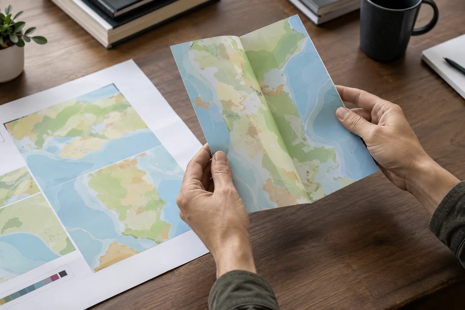
For a folded map or insert, confirm the following before the final file is locked:
- which direction the sheet will fold;
- where the grain runs in relation to the finished fold;
- whether dark solids, color blocks, or fine rules cross the crease;
- whether the stock needs scoring for the chosen format; and
- how the folded piece will be gathered or attached to the text block.
The correct grain and scoring choice depends on the stock and fold design. Use the printer’s recommendation, then test the actual printed sheet. Technical folding guidance shows how coating, printed coverage, grain, scoring, and pressroom conditions affect fold cracking. That makes a folded dummy more useful than a screen proof when a map or insert is part of the Bible.
Kingtai’s Bible dimensions guide offers related context on trim size, page count, typography, and physical handling. Add the fold map, finished insert size, and section attachment to that physical-format review.
How Do Paper Choices Affect Binding and Finished Bulk?
Coated versus uncoated paper affects binding through caliper, bulk, fold behavior, surface friction, and structure. The coating label alone does not tell you whether a Bible will open comfortably or fit its cover.
A thicker or bulkier combination can change the spine calculation and cover dimensions. A thin sheet can reduce bulk but may need careful opacity and handling review. A map section may fold, open, and return differently from the text pages around it. If a mixed-stock section is gathered incorrectly, the reader may feel a step at the section edge or find the insert difficult to open.
Review a bound sample for:
- Opening near the beginning, middle, and end of the book.
- Access to the inner margin after the final binding choice.
- Smooth transition between text pages and inserts.
- Cover fit, spine shape, and edge protection.
- Repeated page turning at the heaviest color and folded sections.
Paper, binding, and cover should be selected as one system. A paper quote that ignores page count, section structure, and finished bulk is incomplete for a Bible project.
What Should Buyers Compare in a Paper Quote?
A useful quote compares the full production specification, not “coated” against “uncoated” as abstract categories. A lower line-item price may be irrelevant if grade, coverage, page count, folding, or finishing changes.
| Quote input | What to specify | Why it changes the comparison |
|---|---|---|
| Content role | Text, map, chart, worksheet, or insert | Different surfaces may be tested for different jobs |
| Paper grade and thickness | Proposed grade, caliper, shade, and opacity information | Controls feel, bulk, show-through, and print behavior |
| Page and section plan | Total pages, color sections, folded pieces, and mixed stocks | Affects gathering, binding, spine, and waste planning |
| Print coverage | Black text, spot color, full color, solids, and fine detail | Changes the visual result and finishing risk |
| Folding and finishing | Grain, scoring, crease, lamination, or edge treatment | Affects fold quality and handling |
| Quantity and format | Trim size, edition count, and quantity range | Makes unit and setup comparisons meaningful |
| Proof requirement | Swatches, contract or color proof, folded dummy, and bound sample | Gives the buyer a physical approval basis |
The coating category is one input among these. Ask the printer to quote comparable alternatives and identify what changes between them. Keep paper price, color process, finishing, section gathering, and packing visible in the same review instead of assuming that one category carries a fixed cost advantage.
How Should You Sample Coated and Uncoated Paper?
Sample both directions on the actual Bible content, then inspect the result as a bound product. A useful sample plan moves from paper swatches to printed pages, folded inserts, and a physical dummy or bound sample.
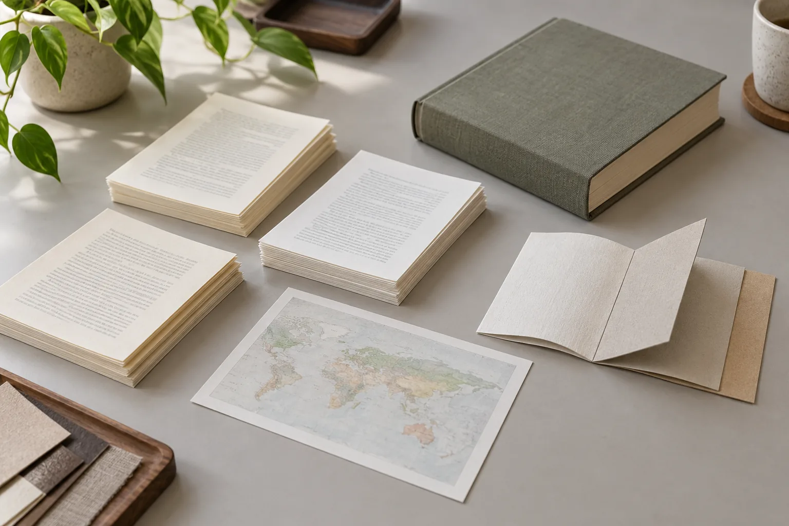
- Start with paper samples. Compare shade, surface, feel, opacity, and bulk under the light in which the Bible will be used.
- Print representative text. Use the real type, footnotes, rules, darkest pages, and line-matched layout. Check show-through and small-type sharpness.
- Print a demanding map or chart. Include fine lines, small labels, close colors, dark areas, and the intended finish. Check detail, glare, and color separation.
- Fold the insert. Test the actual fold sequence, grain direction, scoring, printed coverage over the crease, and any attachment to the text block.
- Bind the sample. Open near the spine and around the insert, turn pages repeatedly, and check the cover, spine, section transition, and finished bulk.
- Record the approval. Keep the selected paper references, layout version, color target, fold map, binding direction, and inspection points with the production file.
Kingtai’s Bible printing case study reflects the value of moving from requirements and sampling toward a stable production direction. For a new brief, the custom Bible printing page and contact page give buyers a way to present the content roles, paper alternatives, and sample questions together.
What Is the Practical Paper Choice for Bible Projects?
The practical choice in an uncoated versus coated paper decision depends on what each section must do. Text pages may favor low glare and controlled show-through. Maps may favor a coated surface for color and fine detail, balanced against glare and fold behavior. Inserts may need a separate decision based on text density, writing, color, and attachment.
Start with the content map, compare paper grades rather than category labels, and ask for a printed, folded, and bound sample. That sequence exposes the interactions between paper, ink, folding, binding, cover, and reader use before the order is fixed.
If you are preparing a Bible edition, share the page roles and physical priorities through the Kingtai homepage so the paper decision can be reviewed with the rest of the production plan.
FAQ 1: Is coated paper better for every Bible map?
No. Coated paper often supports color and fine detail, but glare, fold behavior, lighting, and the map’s use can favor a matte option or an uncoated alternative. Test the actual map.
FAQ 2: Is uncoated paper better for Bible text?
It can be a strong direction for low-glare, text-heavy reading, but opacity, smoothness, ink, layout, and lighting still determine comfort. Approve a representative text sample.
FAQ 3: Can text pages and maps use different paper?
Yes, a project can plan mixed stocks or a separate insert. Confirm section order, page bulk, folding, gathering, color proofing, and binding before approval.
FAQ 4: Does coated paper always cost more?
There is no universal answer. Compare the actual grade, thickness, page count, color coverage, format, quantity, finishing, and mixed-stock work in the quote.
FAQ 5: What should a paper sample prove?
It should show text readability, show-through, color and fine detail, glare, fold quality, page turning, section attachment, cover fit, and finished bulk in the intended binding.