
Creating an effective product packaging design for small businesses requires a strategic blend of structural protection, brand storytelling, and technical manufacturing alignment. Many growing brands struggle with uninspiring, generic boxes that get completely ignored by customers on retail shelves or during unboxing. This lack of distinct visual appeal agitates consumer indifference, undercuts your product’s premium value, and leads to costly transit damages. Fortunately, investing in a custom packaging design solves these structural and branding headaches by turning a simple utility container into an unforgettable brand ambassador.
Why does product packaging matter for small businesses?
Product packaging matters for small businesses because it acts as the primary physical bridge between your digital brand presence and real-world customer interactions. An intentional and eye-catching packaging design instantly elevates the perceived value of your items and builds immediate brand recall. It acts as a 24/7 silent salesperson that communicates your quality and attention to detail before the customer even opens the box. By prioritizing professional structures, you differentiate your brand from mass-market competitors while reinforcing purchase satisfaction.
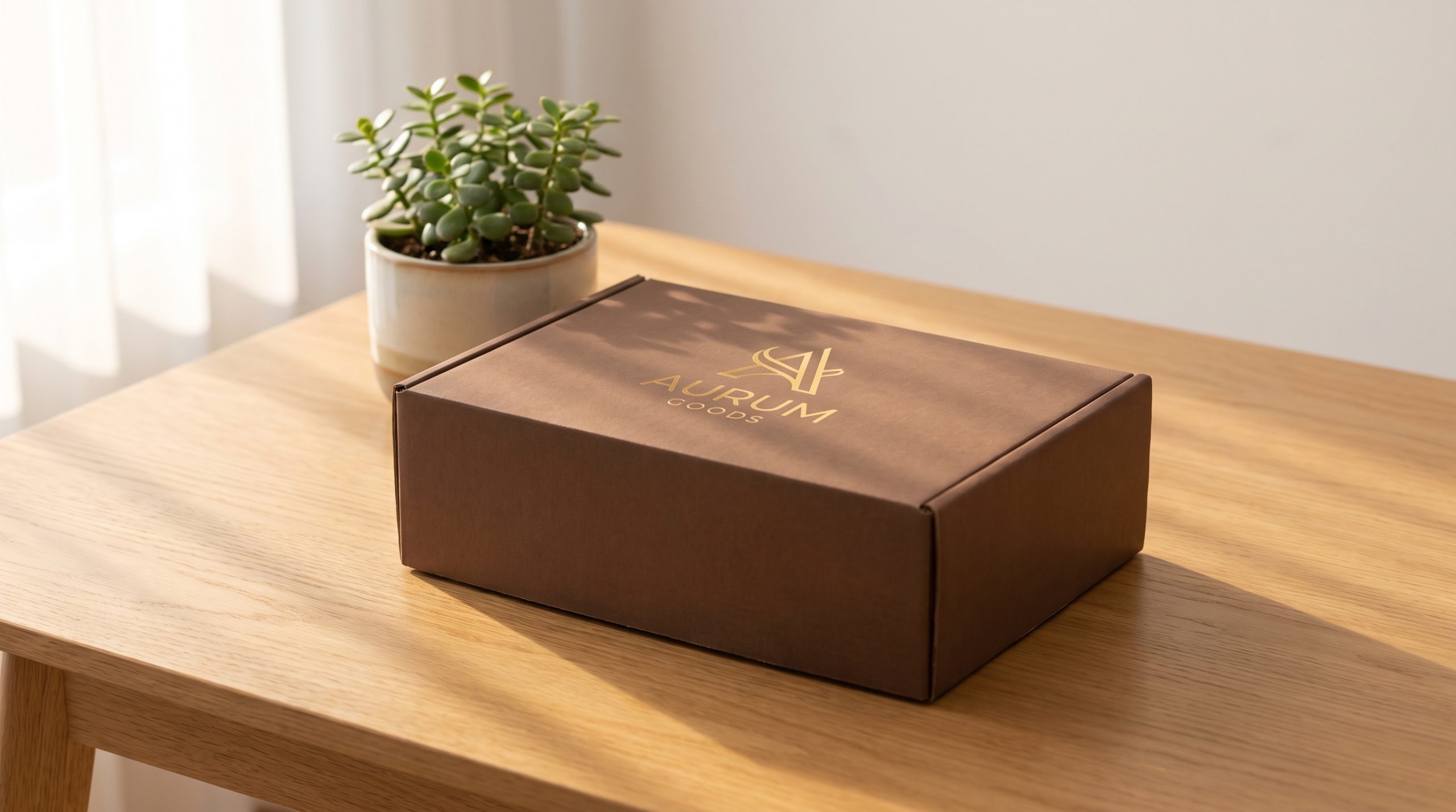
What is packaging design exactly?
Packaging design is the thoughtful synthesis of structural engineering, graphic design, and material science tailored to protect and showcase a product. It serves a functional purpose while simultaneously delivering a curated sensory experience to the end-user.
Your box is much more than just a cardboard shell.
- Outer shipping boxes that absorb freight transit impacts.
- Internal custom-molded wraps that immobilize fragile items.
- Graphic elements, brand color palettes, and typography.
- Tactile cardstock textures and premium surface coatings.
Selecting the right combination of these materials builds a functional container that keeps your products safe while reinforcing your branding.
How does design build trust with customers?
Design builds trust with customers by serving as a visual proxy for the quality and reliability of the product nested inside. When a buyer receives a clean, sturdy box with crisp printing, they instinctively feel that the brand values excellence.
Let’s be honest: flimsy materials and blurry graphics immediately signal a cheap, untrustworthy product.
- Thick cardboard walls that resist crushing during transit.
- Sharp, high-resolution vector printing with zero color bleeding.
- Intact structural seals and secure corner tabs.
- Clear, legible font layouts explaining product details.
Achieving these high manufacturing standards ensures your brand arrives looking pristine and professional.
Can packaging tell your brand’s story?
Packaging can absolutely tell your brand’s story by using sensory cues, custom messaging, and colors to show customers what you stand for. From eco-friendly kraft paper to elegant gold foil accents, every material choice speaks volumes about your identity.
Picture this: a customer unboxes a beautifully wrapped organic cosmetic product that speaks directly to their personal eco-conscious lifestyle.
- Inspirational origin statements printed on interior lid flaps.
- Sustainable soy-based inks on biodegradable kraft stock.
- Earthy, natural color tones that highlight purity.
- Elegant textures that evoke a feeling of handcrafted luxury.
Key Takeaway: For B2B businesses, designing a narrative-driven container helps establish immediate brand differentiation and builds long-term customer loyalty.
| Storytelling Type | Key Visual Elements | Targeted Customer Response | |
|---|---|---|---|
| Sustainable/Eco-friendly | Kraft paper, soy-based inks, minimalist design | Respect for environment, ethical alignment | |
| Luxury/Artisanal | Gold foil accents, embossed linen, deep palettes | Perception of high worth, indulgence, exclusivity |
Analyzing these design elements demonstrates that visual consistency directly shifts customer buying behaviors.
What must you prepare before starting a design?
To prepare before starting a design, you must fully compile your target market demographic data, accurate physical product dimensions, and primary distribution channels. Organizing these foundational assets is the most critical stage of executing a successful packaging design project. Without these specs, you risk ordering boxes that are either too small to fit your products or too weak to protect them. Taking the time to gather this technical data secures a smooth manufacturing transition.
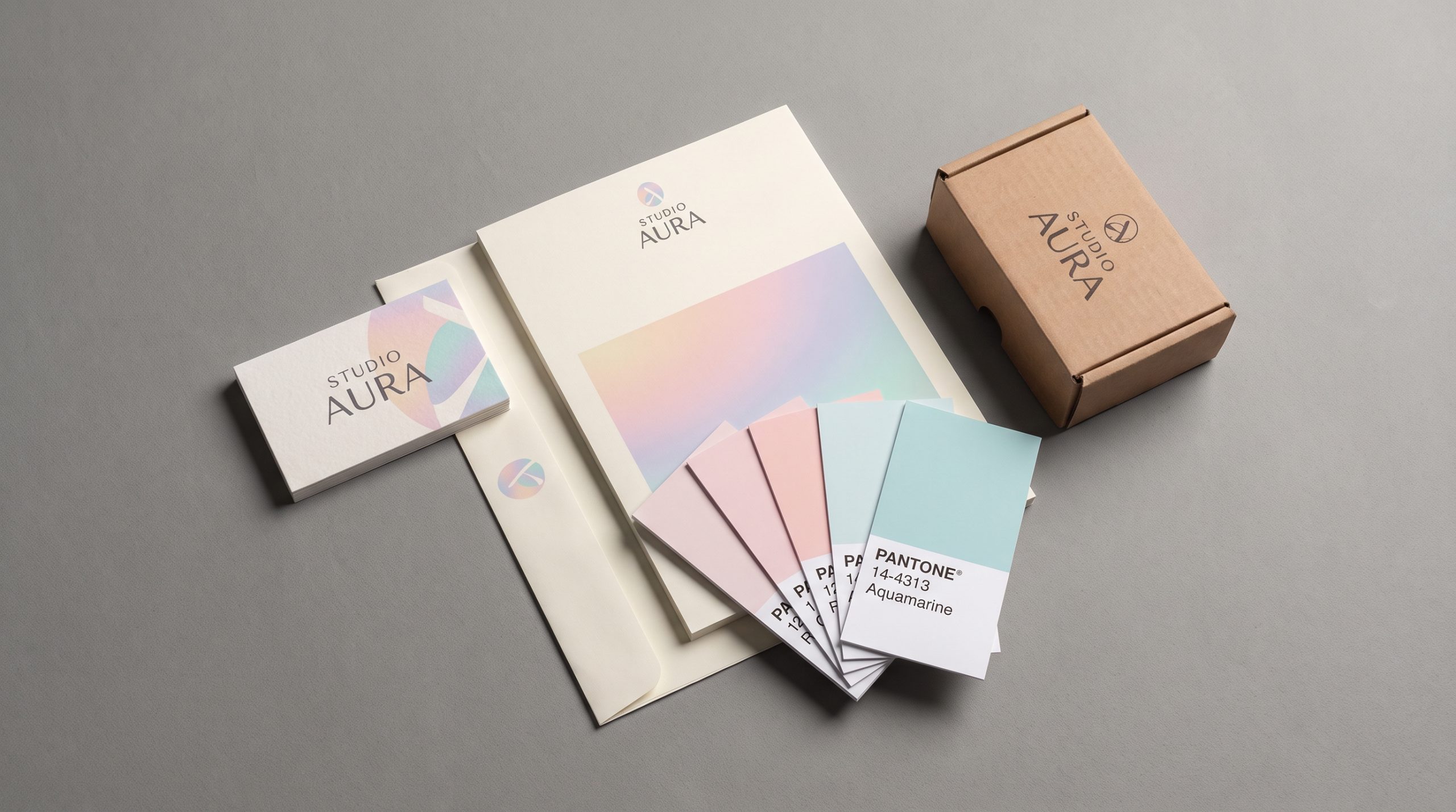
Who is your target audience?
Defining your target audience ensures your visual style speaks directly to the consumers most likely to buy your product. Understanding their visual tastes allows you to select colors, shapes, and textures that match their lifestyle expectations.
Here is the kicker: different age groups demand completely unique design languages.
- Gen Z buyers who seek minimalist layouts and earth-friendly materials.
- Luxury shoppers who expect heavy rigid boxes with soft finishes.
- Practical consumers looking for clear labels and reusable boxes.
Designing with a specific demographic in mind prevents your brand from getting ignored.
What are the physical specs of your product?
The physical specifications of your product determine the overall thickness, structural layout, and strength of your manufacturing materials. You must document exact three-dimensional measurements and weight profiles to ensure a flawless structural fit.
Think about this: shipping heavy or fragile items requires heavy-duty structural reinforcement.
- Precise 3D dimensions including length, width, and depth.
- Total gross weight of the item to choose paperboard thickness.
- Product fragility score to determine protective insert requirements.
Acquiring these metrics guarantees your container protects your goods throughout shipping.
How are customers buying your product?
How customers buy your product determines whether you should design for the harsh shipping environment of e-commerce or the crowded retail shelf. Each sales channel demands a unique combination of visual messaging and structural defense.
What does this mean for you? You must optimize your box for its final shipping environment.
- Retail-ready structural features like convenient hang tags.
- Robust e-commerce shipping boxes that survive drop tests.
- High-contrast shelf graphics that capture attention instantly.
Key Takeaway: Optimizing your box style for your distribution channel prevents costly damages and helps secure retail partnerships.
| Audience Segment | Primary Design Preference | Core Material Value | |
|---|---|---|---|
| Gen Z & Millennial | Minimalist aesthetic, pastel/earthy tones | Highly sustainable, plastic-free, recyclable | |
| Luxury Consumers | Monochromatic, heavy weight, foil stamping | Premium rigid textures, magnetic closures |
Analyzing this audience data reveals that custom structural elements are vital for targeting high-value buyers.
Which packaging layers do you need to use?
The packaging layers you need to use typically include an outer package for shipping, an inner layer for protection, and a product container. Using multiple structural layers in your packaging design ensures complete protection while building an engaging unboxing sequence. Each layer serves a unique role in safeguarding your product from friction, moisture, and impact damage. Combining these layers strategically creates a highly professional and luxury-tier presentation.
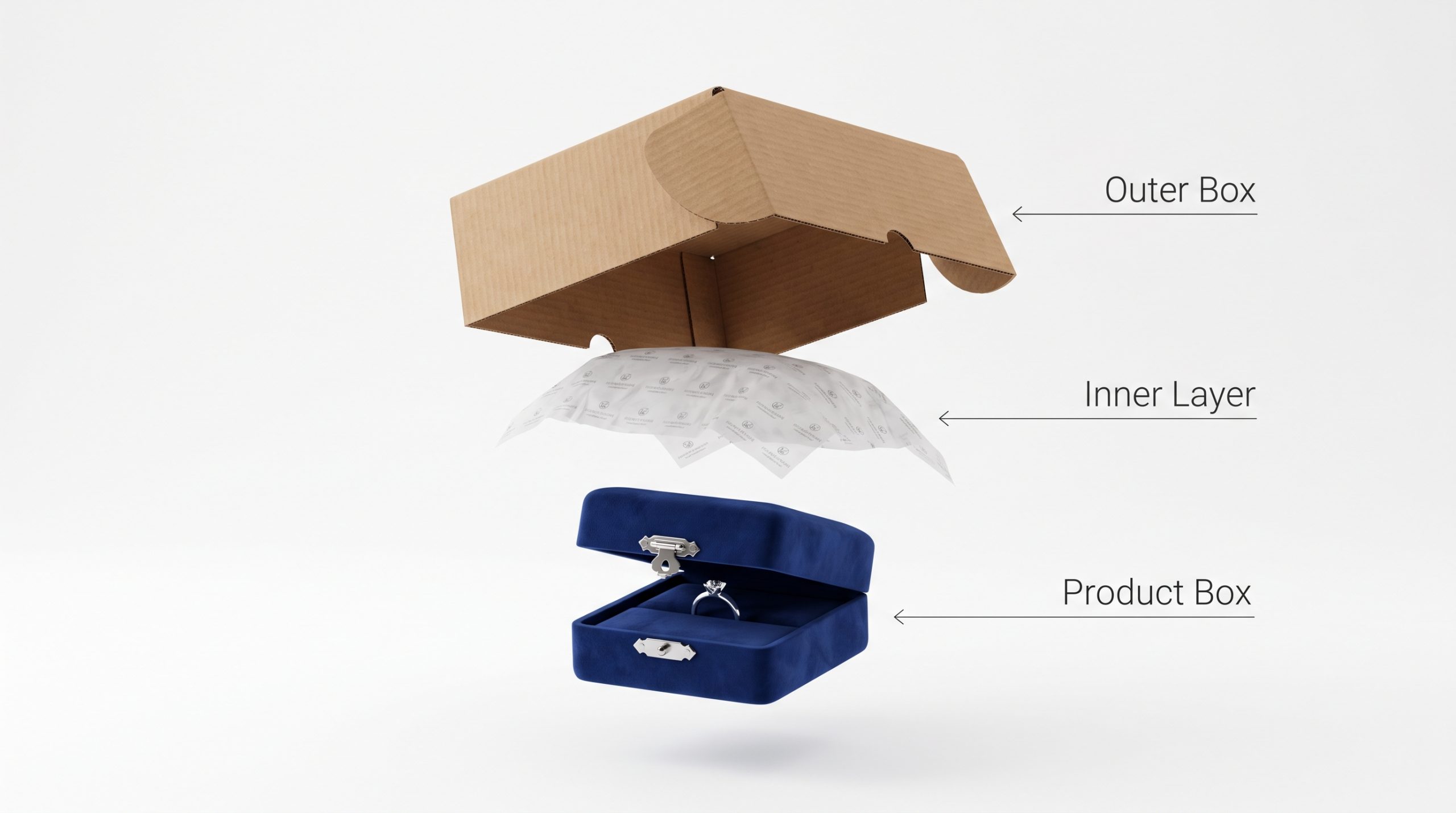
What is outer packaging?
Outer packaging is the first line of physical defense that shields your products from harsh transit environments. This layer includes all exterior shipping boxes and mailers designed to withstand transit stress.
Picture this: your package must survive conveyor belts, rainy doorsteps, and stacked warehouse pallets.
- Corrugated cardboard shipping boxes for heavier goods.
- Padded bubble mailers for lightweight, flexible apparel.
- Custom brand-printed tape that seals joints securely.
Using strong outer boxes ensures your products arrive looking perfect.
Why do you need inner packaging?
Inner packaging is essential because it fills empty space and prevents your product from shifting or breaking during transit. This structural buffer absorbs shocks and vibrations while organizing multiple items inside the box.
Let’s be honest: loose items sliding inside a box are highly prone to surface scratching.
- Delicate custom-printed tissue papers for scratch protection.
- Molded paper pulp trays that hold bottles firmly.
- Biodegradable crinkle paper that cushions heavy items.
Designing precise internal molds keeps your products pristine and well-organized.
How do you style the product container?
Styling the product container involves custom designing the primary bottle, jar, or folding box that directly holds your product. Since this container sits on your customer’s shelf, it must balance long-term utility with exceptional brand aesthetics.
What does this mean for you? Your primary vessel must be both beautiful and highly functional.
- Elegant glass dropper bottles with high-contrast labels.
- Custom-embossed metallic tins that look premium on shelves.
- Sleek folding cartons with smooth matte soft-touch coatings.
Key Takeaway: Selecting premium styling for your primary product container elevates your brand’s presence in your customer’s home.
| Outer Format | Recommended Use Case | Cost-to-Weight Efficiency | |
|---|---|---|---|
| Corrugated Box | Large, heavy, or fragile multi-item orders | High protection, moderate shipping cost | |
| Poly Mailer | Lightweight, non-fragile apparel and soft goods | Low protection, highly economical shipping |
Analyzing these distinct layers outlines the clear balance between transit safety and visual appeal.
How do you choose the right container type?
To choose the right container type, you must evaluate your product’s state, physical durability, shipping methods, and target budget. Selecting the correct container style is a foundational engineering choice that impacts manufacturing budgets, shipping weights, and overall packaging design aesthetics. Flimsy containers can ruin your customer experience, while unnecessarily heavy containers inflate your postal shipping fees. Balancing aesthetic appeal with physical utility leads to the most cost-efficient container selection.
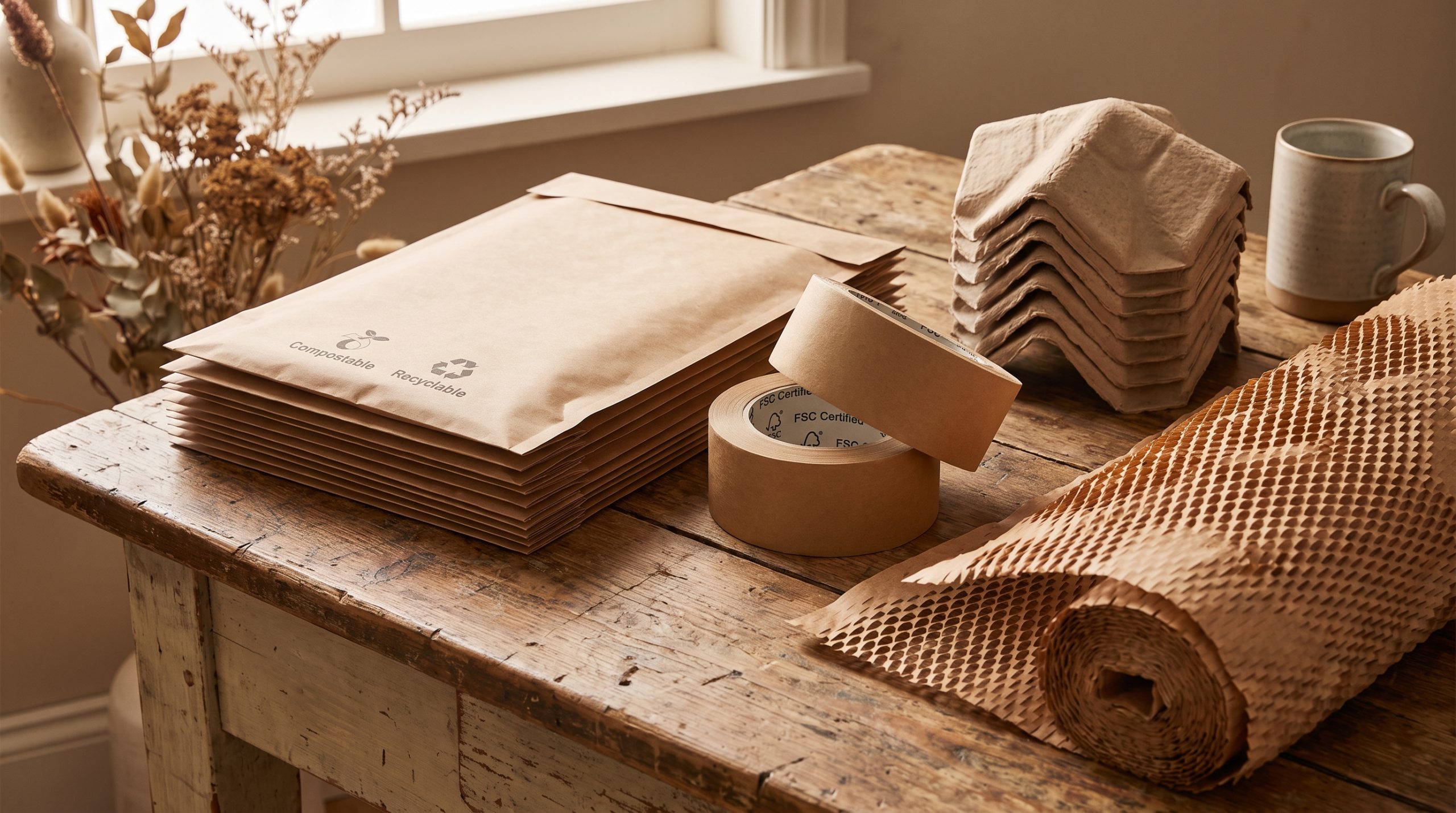
Box, mailer, or pouch: which is best?
Deciding between a box, mailer, or stand-up pouch depends heavily on your product’s weight, form, and retail requirements. Each container type has unique advantages that cater to different product categories and branding styles.
Think about this: flexible pouches save shipping space, but rigid boxes provide elite protection.
- Rigid luxury boxes for jewelry, watches, and premium gifts.
- Foldable cardstock cartons for cosmetics and light retail goods.
- Stand-up pouches with zip locks for coffee and dry foods.
Using the right box style optimizes shelf space and reduces waste.
How do product dimensions affect your choice?
Product dimensions directly dictate the physical size and folding structure of the container you must select. Designing a custom box that mirrors your product’s 3D footprint prevents excessive movement and reduces shipping costs.
Here is the kicker: oversized boxes require massive amounts of plastic filler.
- Exact height, width, and depth measurements for custom-fit boxes.
- Material thickness margins that prevent tight box-seam splitting.
- Shipping volume parameters that lower dimensional weight rates.
Testing a precise prototype ensures a secure and clean fit.
Why choose sustainable packaging options?
Choosing sustainable packaging options helps reduce environmental impact while appealing to eco-conscious consumers who prioritize green brands. Modern eco-friendly materials deliver premium durability and style without generating unnecessary plastic landfill waste.
Picture this: your customers can easily compost or recycle your entire package.
- Biodegradable kraft cardstock and FSC-certified paper options.
- Clean soy-based inks that replace toxic petroleum-based alternatives.
- Natural water-activated paper tape and molded cornstarch inserts.
Key Takeaway: Incorporating green materials into your business structure builds brand loyalty and fulfills environmental standards.
| Container Type | Material Source | Best Application | |
|---|---|---|---|
| Stand-Up Pouch | Flexible laminate film / Kraft paper | Coffee, dry snacks, powdered beauty products | |
| Folding Carton | SBS paperboard, clay-coated kraft | Cosmetics, small electronics, packaged retail foods |
This material breakdown confirms that matching product style with container shape reduces overall waste.
How do you prepare files for your printer?
To prepare files for your printer, you must translate your artwork into high-resolution vector dielines using CMYK color channels. Proper file preparation ensures your creative packaging design looks as stunning in physical print as it does on your digital screen. Neglecting prepress checklists leads to misaligned cuts, blurry graphics, and expensive printing delays. Following standard technical protocols guarantees a clean, high-quality manufacturing run from your first batch.
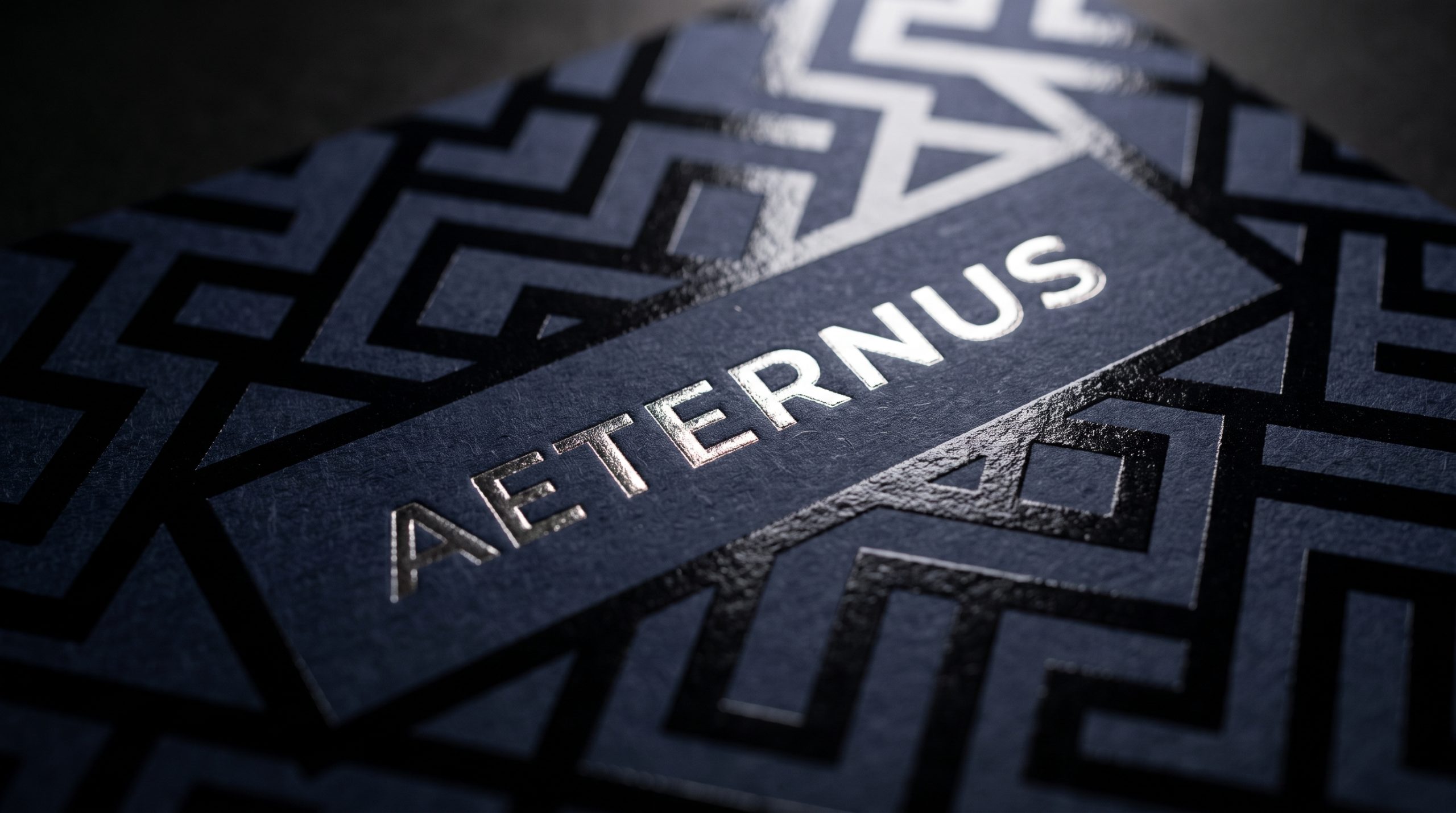
What is a dieline and why is it vital?
A dieline is a flat vector blueprint that guides the physical cutting and creasing machinery during the manufacturing process. It serves as the exact spatial guide for your graphic designer to layout colors, text panels, and logos correctly.
Let’s be honest: trying to layout artwork without a vector dieline leads to crooked panel prints.
- Solid red lines that tell the machine where to cut paperboard.
- Dotted blue lines that show where the paperboard creases.
- Clean glue tabs that keep the final box assembled securely.
Building artwork around vendor dielines guarantees precise box folds.
Which file formats and color codes work best?
Vector-native PDF and Adobe Illustrator (.AI) formats are the absolute best choices for submitting pristine, scalable graphics to your print shop. You must work exclusively in CMYK and Pantone color environments to maintain perfect color accuracy.
What does this mean for you? Screen-based RGB files will suffer from dull color shifts.
- Vector EPS or AI files that scale infinitely without pixelation.
- CMYK color codes that map perfectly to physical ink printing.
- Pantone matching colors for brand logos requiring flawless consistency.
Setting up vector lines protects your text and logos from blurring.
How do you avoid common printing errors?
You can avoid common printing errors by executing a rigorous pre-flight checklist and verifying physical press proofs before mass production. Checking font outlines, bleed zones, and resolution standards eliminates costly printing mistakes early.
Think about this: converting text to vector outlines prevents missing font issues on press.
- Minimum 3mm bleed areas to avoid white gaps at edges.
- Images set to 300+ DPI to eliminate blurry print results.
- Barcodes scaled correctly so they scan easily at checkout.
Key Takeaway: Approving a physical pre-production sample helps small businesses catch structural and graphic alignment errors before printing thousands of boxes.
| Color System | Suitable Media | Color Match Reliability | |
|---|---|---|---|
| CMYK (Four Color) | Digital/Offset Print | Good for photographic artwork and general graphics | |
| Pantone (PMS) | Spot Ink Offset Print | Perfect across print runs; essential for logo matches |
This technical color comparison underscores the value of using professional print standards during file prep.
How do you structure your package information?
You structure your package information by building a clear visual hierarchy that guides the customer’s eye from your brand logo to key benefits and regulatory details. Designing a clean information flow is a vital requirement of professional packaging design that connects with customers in seconds. Cluttered boxes confuse consumers, making them look past your product in favor of cleaner alternatives. Placing your key message front and center ensures your value is communicated instantly.
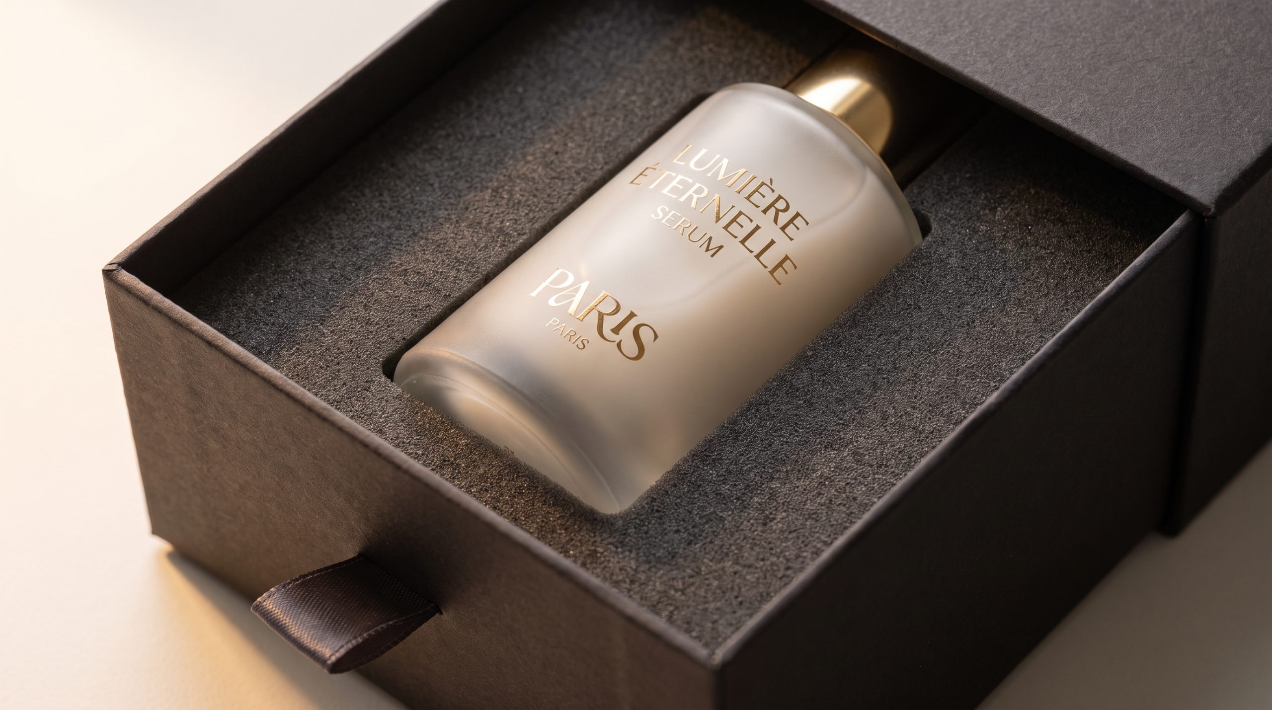
What is information architecture?
Information architecture is the visual ranking system used to present your copy in order of importance. This system ensures shoppers absorb your name, product type, and core benefits in a natural sequence.
Picture this: a shopper spends less than three seconds deciding whether to pick up your product.
- Primary logo placement for instant brand name recognition.
- Bold, readable product titles that clarify what is inside.
- Secondary text panels showcasing main benefits or flavors.
Developing a visual order makes your product shelf-ready.
How do you highlight your key selling point?
Highlighting your key selling point requires using clean minimalist badges, generous negative space, and contrasting typography to emphasize your product’s unique value. Making this detail pop helps you convince scanning shoppers to choose your brand.
Here is the kicker: trying to highlight everything on your package means nothing stands out.
- Eye-catching organic icons that quickly show product purity.
- Contrasting brand colors that draw focus to specific details.
- Clean blocks of negative space around your main tagline.
Isolating your main benefit ensures customers remember why your brand is special.
Where should regulatory info be placed?
Regulatory information must be placed on the side and bottom panels of your container to comply with legal codes while keeping your primary panels clean. This separation keeps your marketing faces focused on brand storytelling.
Let’s be honest: crowding your front cover with ingredient lists ruins your design aesthetics.
- Bottom or back placement for standard UPC barcodes.
- Side panel layouts for ingredient decks and allergen statements.
- Standardized sizing and legible fonts for warning symbols.
Key Takeaway: Placing compliance details on secondary surfaces maintains clean visual branding while satisfying all consumer packaging regulations.
| Visual Tier | Intended Reading Distance | Best Font Size Proportion | |
|---|---|---|---|
| Tier 1 (Logo & Title) | 3 feet (shelf distance) | Large, high-contrast, dominant weight | |
| Tier 2 (Subhead/Benefit) | 1 foot (in-hand inspection) | Medium, clean, easily legible sans-serif font |
Analyzing visual tier placement highlights how a clean hierarchy dramatically improves retail scanning and consumer trust.
How do you evaluate your packaging design?
To evaluate your packaging design, you must test its visual brand alignment, physical folds, and font legibility using 3D prototypes. Reviewing these physical elements before manufacturing helps you identify errors before investing in production. Folds that overlap incorrectly or colors that look washed out can hurt your customer experience. Evaluating mockups ensures that your production run aligns with your brand standards.
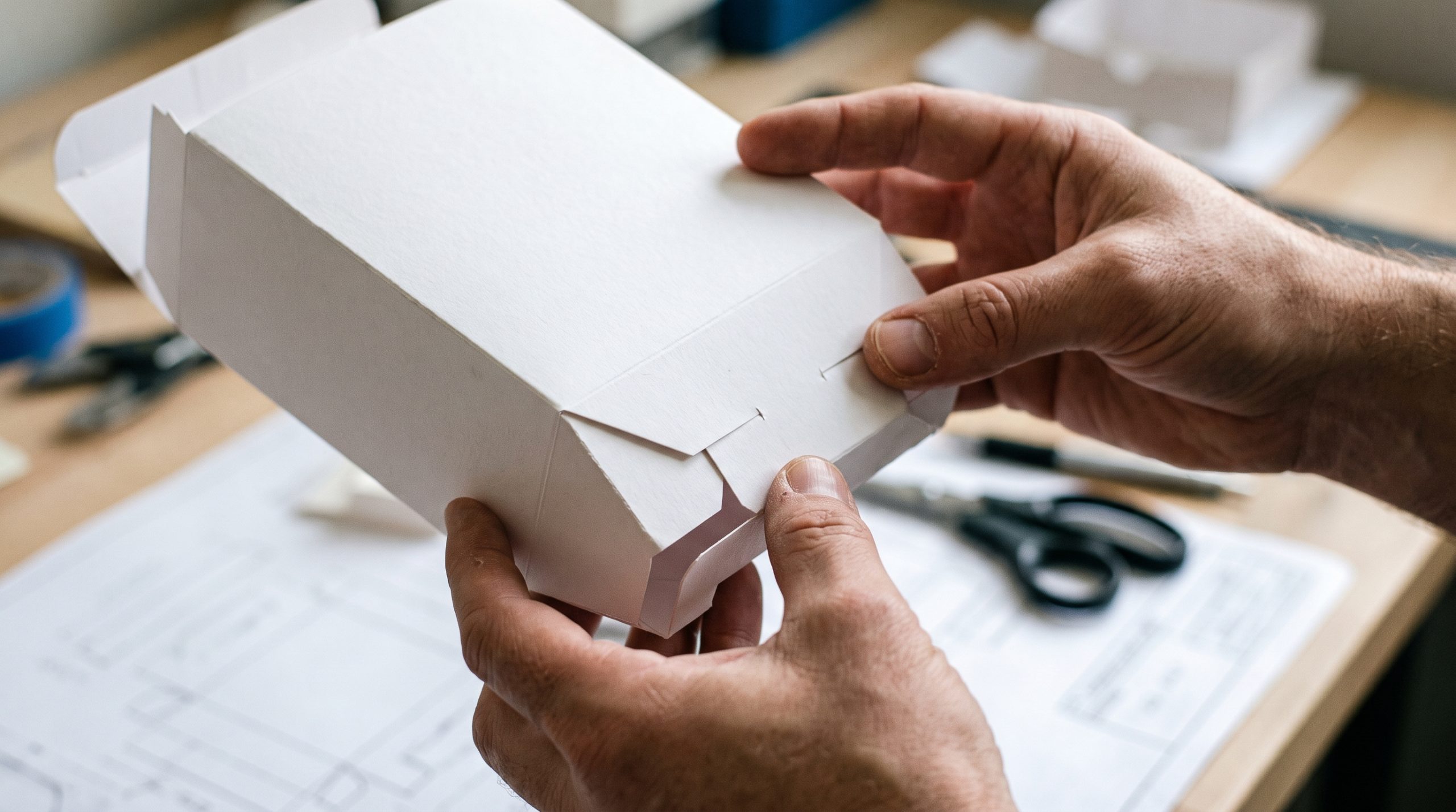
Does your design match your brand?
Ensuring your package matches your brand identity requires checking the colors, fonts, and textures against your brand style guidelines. Consistent presentation across your website and physical box is key to building consumer trust.
Think about this: receiving a package that looks different from your website ruins brand consistency.
- Matching paperboard finishes with your organic or luxury focus.
- Aligning typography styles with your core digital branding.
- Verifying hex codes translate perfectly to printed CMYK tones.
Visual alignment builds a reliable identity that buyers respect.
Will this design look good in 3D?
Evaluating your flat 2D layout in a physical 3D environment helps you catch graphic distortion and text alignment errors before manufacturing. Folding a physical mockup lets you test how the sides interact and lock.
What does this mean for you? Flat digital art can look distorted once folded into a 3D box.
- Digital 3D renders that display box panels from all angles.
- Printed paper-and-tape models that let you test the opening fold.
- High-quality sample proofs to verify final paper thickness.
Testing physical boxes guarantees your layout aligns perfectly.
Is the design easy to read from a distance?
A legibility check ensures that shoppers can read your product name and brand details from a distance on retail shelves. High-contrast colors and clean font weights help your package stand out in busy aisles.
Picture this: a product with low contrast simply disappears next to vibrant competitors.
- High-contrast pairings like black text on white backgrounds.
- Bold serif or sans-serif fonts for the main product name.
- Clean borders and layout grids that prevent overlapping copy.
Key Takeaway: Verifying distant legibility on mockups helps small businesses secure physical shelf placements and attract scanning shoppers.
| Brand Channel | Primary Visual Asset | Alignment Check | |
|---|---|---|---|
| E-Commerce Site | High-key digital hex colors | Must translate to printed CMYK equivalents | |
| Physical Package | Cardboard textures/inks | Must reflect the same luxury or eco values as the site |
This cross-channel review demonstrates why testing physical visual assets protects your brand consistency.
Why is gathering design feedback so critical?
Gathering design feedback is critical because it helps you identify readability problems and visual flaws that you might overlook during your creation process. Collecting honest feedback is a vital step in packaging design that helps you identify visual issues and reading pain points before printing thousands of units. Fresh perspectives from customers and print experts ensure your container works well and appeals to buyers. Polishing your design based on real feedback prevents costly reprint fees.

Who should you ask for feedback?
To secure valuable critiques, you should ask target consumers, industry colleagues, and your manufacturing print team for feedback. Each of these groups offers unique perspectives on visual style, usability, and technical production limits.
Let’s be honest: relying only on friends and family leads to polite but unhelpful feedback.
- Active repeat customers who understand your current value.
- Target demographic shoppers who match your customer persona.
- Print manufacturers who can point out structural and layout issues.
Consulting multiple sources ensures your final layout stands out.
How do you avoid bias in design critiques?
You can avoid bias in design critiques by asking neutral, task-oriented questions rather than asking for general likes or dislikes. Structuring your test professionally helps you gather objective data on legibility and appeal.
Here is the kicker: biased prompts like “Don’t you love this color?” lead to skewed data.
- Blind A/B split testing between two design options.
- Asking testers to find the product name within three seconds.
- Requesting anonymous surveys to gather honest, unbiased thoughts.
Using objective feedback models helps you build a better design.
What changes should you prioritize?
You should prioritize revisions that fix critical reading issues, legally required details, and weak structural joints over minor aesthetic edits. Focus on functional issues first to ensure your package is safe and shelf-ready.
Think about this: a gorgeous container is useless if the barcode fails to scan.
- Fixing unreadable warnings or pixelated ingredient lists.
- Reinforcing weak folding tabs that tear during assembly.
- Tweaking low-contrast backgrounds to make text legible.
Key Takeaway: Prioritizing technical and structural revisions protects your budget while ensuring your container performs well on retail shelves.
| Feedback Source | Primary Area of Value | Potential Source Bias | |
|---|---|---|---|
| Core Target Audience | Buying interest, design appeal | May lack technical understanding of production limits | |
| Packaging Print Rep | Structural issues, cost-savings | Highly technical; focused on print limits over aesthetic |
Analyzing feedback sources shows how balancing customer opinions with print expert advice leads to an optimized design.
How do you create an unboxing experience?
To create an unboxing experience, you must design an engaging physical sequence using custom sticker seals, botanical tissue wraps, and printed interior messaging. Incorporating these premium features into your packaging design transforms a routine shipping delivery into a memorable brand interaction. These thoughtful details increase perceived value and encourage customers to share their excitement online. Designing a beautiful unboxing journey builds lasting loyalty and drives repeat sales.
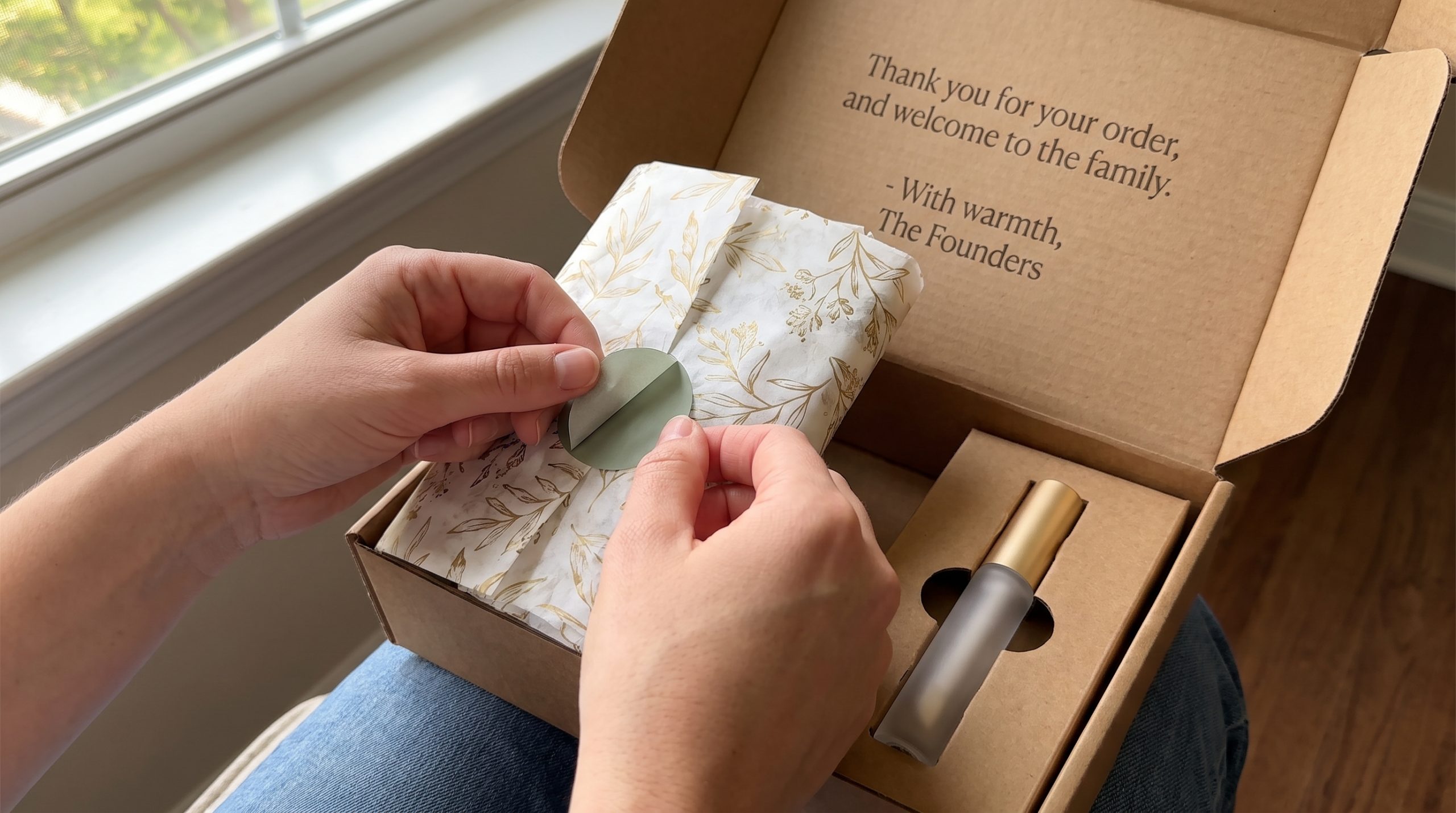
What makes unboxing feel like a gift?
You can make unboxing feel like a gift by adding tactile steps like peeling back custom sticker seals or untying ribbons. Creating a slow, multi-layered reveal builds excitement as customers open your box.
Picture this: a slow reveal makes customers feel like they are opening a luxury present.
- Premium custom sticker seals that feel satisfying to peel.
- High-quality botanical or branded pattern tissue paper wraps.
- Welcoming greeting copy printed on the inside lid.
Adding premium tactile elements helps you build a lasting connection.
Can inserts and tissue paper boost loyalty?
Custom tissue wraps and personalized cards are highly effective tools for turning one-time buyers into loyal brand advocates. Including these low-cost items shows your appreciation and brings customers back to your online store.
What does this mean for you? Extra items like thank-you notes drive repeat business.
- Custom thank-you notes printed on thick cardstock paper.
- Special discount codes that encourage repeat web purchases.
- Clean informational inserts explaining product care and use.
Adding thoughtful inserts increases customer satisfaction and retention.
How do you encourage social media sharing?
You can encourage social media sharing by printing your social handles and branded hashtags inside your container lid. Designing beautiful, photo-friendly layouts inspires customers to post unboxing videos online.
Let’s be honest: customers love sharing high-quality, beautiful boxes with their followers.
- Clear “@YourBrand” handles printed on high-contrast interior flaps.
- Catchy unboxing hashtags that group user-generated content online.
- Vibrant, eye-catching interior colors that look great on video.
Key Takeaway: Including social calls-to-action inside your package turns every shipment into a free organic marketing opportunity.
| Premium Feature | Sensory Interaction | Perceived Brand Value | |
|---|---|---|---|
| Branded Sticker Seal | Peeling action, tension sound | High; signals that the inner contents are secure and premium | |
| Custom Flap Graphic | Surprise greeting message | Very high; creates an immediate friendly brand connection |
Evaluating these unboxing details demonstrates how minor structural additions can spark massive social media engagement.
Which packaging terms must you know?
The packaging terms you must know include dieline, bleed, CMYK, and vector files to ensure clear communication with your manufacturing print team. Understanding these technical terms is essential for executing a professional packaging design without costly delays. Knowing these core words helps you coordinate with your printer and set files up correctly. Mastering this language ensures your finished boxes match your design layouts.
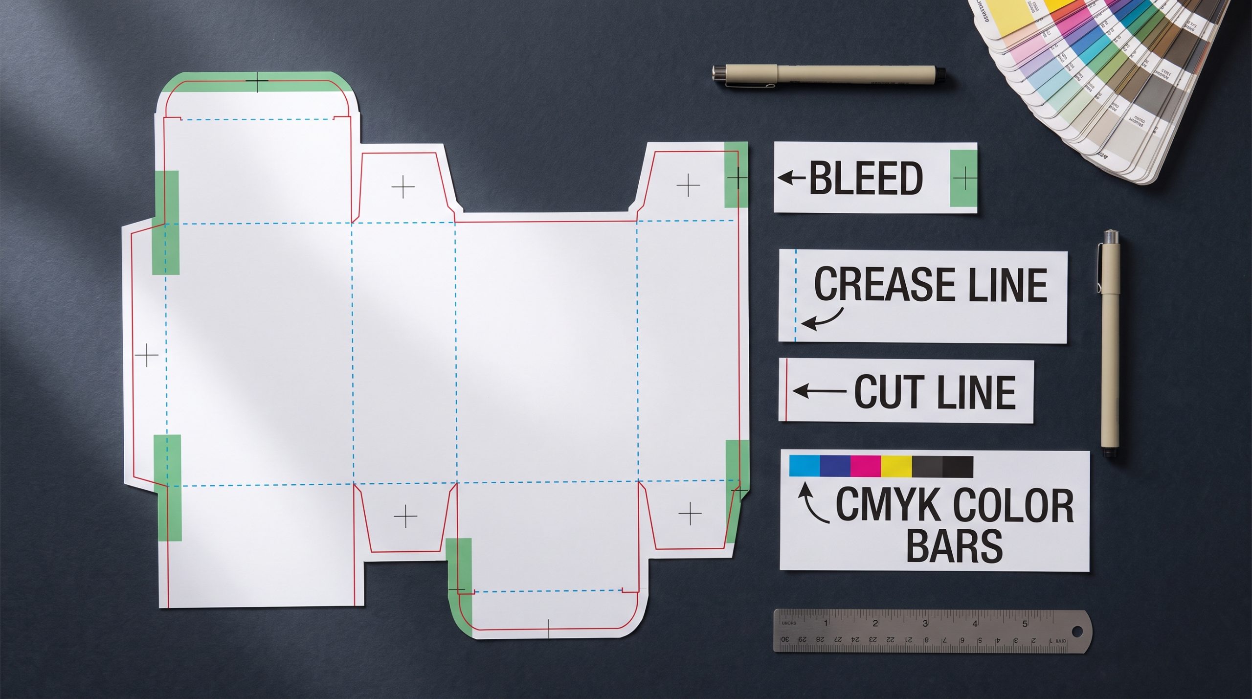
What do dieline, bleed, and CMYK mean?
Dieline, bleed, and CMYK are prepress industry standards used to describe template lines, ink margins, and color layouts. Knowing these words helps you set up artwork that aligns perfectly with cutting machines.
Think about this: a minor error in your bleed margins can cause white gaps along your box seams.
- Dielines: vector blueprints showing cutting and creasing paths.
- Bleeds: extending artwork 3mm past cutting lines to avoid gaps.
- CMYK: the four ink colors used for professional printing.
Using these technical terms helps you set up professional, press-ready files.
What is the difference between RGB and CMYK?
The difference between RGB and CMYK is that RGB is designed for digital screens, while CMYK is designed for printing physical inks on paperboard. You must design in CMYK mode to avoid major color shifts during production.
Here is the kicker: vivid neon screen colors often look dull when printed with physical ink.
- RGB: a light-based digital color profile for screens.
- CMYK: an ink-based physical color profile for commercial presses.
- Color gamut limits that affect physical ink matching.
Converting files to CMYK early guarantees your final colors print accurately.
What are vector vs raster files in print?
Vector files use mathematical formulas to scale lines infinitely without losing clarity, whereas raster files use fixed grids of pixels that blur when enlarged. You must use vector graphics for all logos, lines, and text.
What does this mean for you? Using raster files for logos results in blurry, pixelated prints.
- Scalable vector formats like AI, EPS, and PDF files.
- Pixel-based raster formats like JPG and PNG files.
- Resolution limits that require 300+ DPI for raster photos.
Key Takeaway: Submitting clean vector assets ensures your brand logos and text lines print with crisp clarity.
| Print Vocabulary | Definition | Why You Must Know It | |
|---|---|---|---|
| Bleed Area | Artwork extending 3mm past cutting lines | Prevents thin white gaps along box edges after cutting | |
| Dieline | Flat 2D outline of box template folds | Ensures your design panels align perfectly on folds |
This vocabulary breakdown highlights how mastering basic prepress terms helps you avoid costly errors.
Partnering with an experienced packaging and printing manufacturer like Kingtai helps small businesses bring their product box designs to life. Whether you need custom watch boxes, cosmetic boxes, luxury rigid packaging, or premium custom book printing, Kingtai has the technical capabilities and material options to deliver exceptional results. Ready to elevate your retail brand presence and safeguard your products during shipping? To get started on your custom box manufacturing journey, contact us today to receive a quote and sample proofs from our expert printing team.
Frequently Asked Questions
Can I design my packaging if I don’t have professional graphic design experience?
Yes, you can absolutely begin your layout using simplified online templates and design builders. However, as your brand grows, transitioning to professional vector tools like Adobe Illustrator is critical to ensure file compliance. For complex box shapes, hiring a professional packaging designer will help you avoid costly print-run errors.
What’s the best way to keep my per-item packaging costs down when starting out?
The best way is to pair standard-sized blank boxes with highly customized interior components. Instead of buying complex high-volume custom containers immediately, you can purchase budget-friendly cardboard boxes and dress them up with printed tissue papers, branded sticker seals, and custom paper sleeves. This smart approach keeps your initial overhead low while delivering a premium, custom unboxing experience.
How do I know if my dieline setup is correct before sending it to the printer?
Yes, you can perform a quick, reliable validation check by building your own paper mockups at home. Simply print your vector dieline flat on standard office paper, manually cut along the solid red paths, crease the blue lines, and fold the box together. Inserting your actual product into this quick paper template will instantly show you if the dimensions fit correctly.
Can I use sustainable packaging materials without sacrificing protection or style?
Yes, eco-friendly materials can deliver exceptional structural durability and a premium, high-end look. Modern manufacturing techniques utilize FSC-certified kraft paperboard, plant-based soy inks, and sturdy custom-molded paper pulp inserts that protect fragile items while looking incredibly clean and modern. Choosing sustainable options allows you to capture eco-conscious markets while maintaining a highly professional visual style.