
Bible typesetting and readability is the foundational science of balancing micro-typography, paper selection, and precision layout design to ensure dense scripture text is beautiful, clear, and highly legible for long reading sessions. Many publishers face high return rates and poor reviews because their scriptures are printed on thin paper with cramped, illegible structures. Readers become exhausted when words bleed through the page and sentences run together in a crowded mass of ink. You can overcome these visual hurdles and capture premium market margins by choosing a custom-engineered bible font that maintains its crisp clarity under demanding high-speed printing presses.
How Does Type Size Impact Bible Readability?
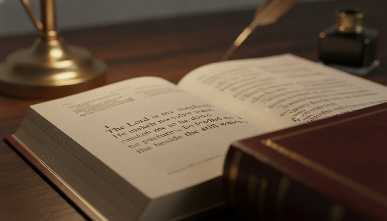
Type size directly impacts Bible readability by establishing the delicate balance between reader visual comfort and the physical page-count thickness of the finished book. Selecting the appropriate scale for your bible font ensures that your target demographic can comfortably read without experiencing visual fatigue. If the characters are too small, older readers and low-vision users will quickly abandon the text. Conversely, making the size too large will balloon your printing budget and shipping costs.
What is the ideal type size for text Bibles?
For standard text Bibles, a type size of 8-point to 10-point represents the industry-wide sweet spot. This range offers an optimal balance that accommodates most general readers while keeping the physical book within reasonable dimensions.
- An 8-point layout keeps pocket editions highly portable and light.
- A 9-point or 10-point scale delivers a comfortable, multi-hour reading session.
- Anything below 8-point requires flawless print execution to prevent characters from blurring together.
How do large-print editions expand market reach?
Large-print editions expand your market reach by directly catering to aging demographics, church leaders, and visually impaired readers. These highly motivated segments are frequently willing to pay a premium price for accessible formats.
- Large-print editions usually feature type sizes ranging from 11-point to 14-point.
- These larger sizes significantly reduce eye strain during extended devotional reading.
- They allow publishers to establish higher retail margins on premium editions.
Key Takeaway: Optimizing type size for specific reader demographics is the easiest way for publishers to expand market share and maximize margins.
| Type Size Category | Point Range | Ideal Target Demographic | Production Impact | |
|---|---|---|---|---|
| Compact / Pocket | 6pt – 7.5pt | Travelers & Youth | Minimizes paper and weight costs | |
| Standard Text | 8pt – 10pt | General Readers | Maximizes balanced print efficiency | |
| Large Print | 11pt – 12.5pt | Seniors & Clergy | Increases page counts by 20% to 30% | |
| Giant Print | 13pt+ | Low Vision Readers | Requires premium multi-volume bindings |
Reviewing the data shows that selecting your target demographic’s ideal type size is a vital economic variable that impacts overall print volume and binding selection.
Which Font Styles Maximize Legibility at Small Sizes?
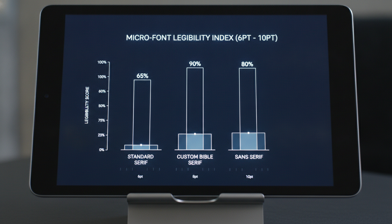
Serif typefaces with high x-heights, open counters, and robust structures are the specific styles that maximize legibility at small sizes. When printing millions of words on ultra-thin paper, choosing a custom-engineered bible font is essential to maintain structural clarity and prevent the fine strokes from breaking or fading under the press. This design philosophy prevents ink from pooling in the delicate loops of letters like ‘e’ and ‘a’.
Why are serif typefaces preferred for scriptures?
Serif typefaces are preferred because their horizontal terminal strokes guide the human eye smoothly along dense lines of text. This visual guidance reduces cognitive processing speed and increases long-term reading endurance.
- Classic serifs match the solemn, historical tone expected of biblical literature.
- The visual brackets on the letters prevent the eye from skipping lines.
- High-contrast serifs remain sharp even when printed on low-GSM paper.
How do custom designs preserve character clarity?
Custom typeface designs preserve character clarity by modifying the internal shapes and junctions of letters to withstand ink-spread. These delicate adjustments prevent character features from filling with excess ink during high-volume print runs.
- Custom designs expand the empty counters inside letters like ‘g’ and ‘o’.
- Subtle weight adjustments prevent thin hairline strokes from disappearing entirely.
- Specially engineered serifs maintain their balance even at 8-point scales.
Key Takeaway: Custom-designed serif typefaces ensure that your text remains highly legible under difficult print environments, protecting your brand’s editorial quality.
| Typeface Style | Counter Design | Ink-Spread Resistance | Style Association | |
|---|---|---|---|---|
| Standard Serif | Tight / Narrow | Moderate | Traditional Book | |
| Custom Bible Serif | Open / Enhanced | High | Premium Scripture | |
| Clean Sans Serif | Geometric | High | Modern / Secular | |
| Decorative Typeface | Complex | Very Low | Specialized Display |
The table highlights how custom-designed serif options deliver superior ink-spread resistance, making them the superior choice for high-density scripture printing.
Why Is Proper Line Leading Essential for Eye Comfort?
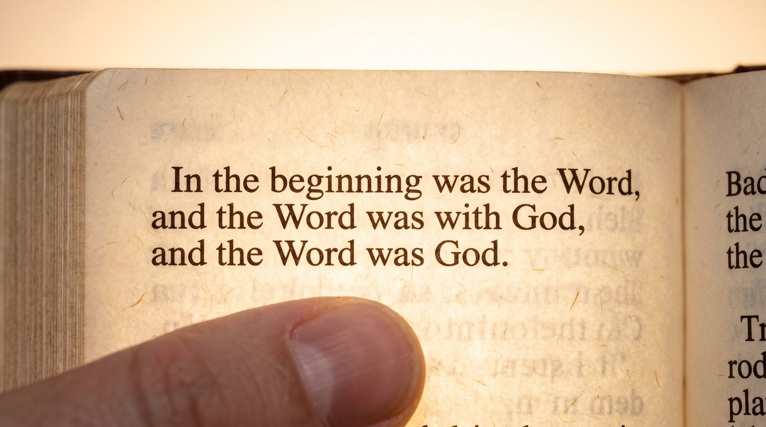
Proper line leading is essential for eye comfort because it creates a consistent vertical buffer of white space that prevents lines of text from visually blending into one another. Correct spacing ensures that when a reader finishes a line, their eyes can easily track down to the start of the next line. This vertical breathing room reduces visual tension and allows your selected bible font to display its natural beauty.
How does leading prevent readers from losing their place?
Generous leading prevents readers from losing their place by defining clear, horizontal corridors for the eyes to follow. Without adequate vertical space, the eyes naturally wander into lines above or below the target text.
- Proper vertical spacing creates resting zones that help the brain register text structure.
- It eliminates the frustration of reading the same line twice.
- Balanced leading is crucial when designing tight, multi-column layouts.
What is the golden ratio for Bible line spacing?
The golden ratio for Bible line leading generally falls between 120% and 130% of the active font size. This ratio provides the ideal balance between page economy and aesthetic appeal.
- An 8-point text layout operates perfectly with a 10-point leading.
- A 9-point setup requires an 11-point leading to look balanced.
- This subtle spacing makes even small text blocks feel open and inviting.
Key Takeaway: Properly calibrated vertical leading is a low-cost, high-impact design choice that directly translates into comfortable, extended reading sessions.
| Font Size (Points) | Minimum Leading | Optimal Leading | Layout Density | |
|---|---|---|---|---|
| 8 Point | 9.0 Point | 10.0 Point | High / Compact | |
| 9 Point | 10.5 Point | 11.25 Point | Medium / Standard | |
| 10 Point | 11.5 Point | 12.5 Point | Low / Devotional |
Evaluating these leading intervals demonstrates that even a half-point adjustment can dramatically alter page layout density and final page count.
Can Line Matching Eliminate Distracting Ghosting?
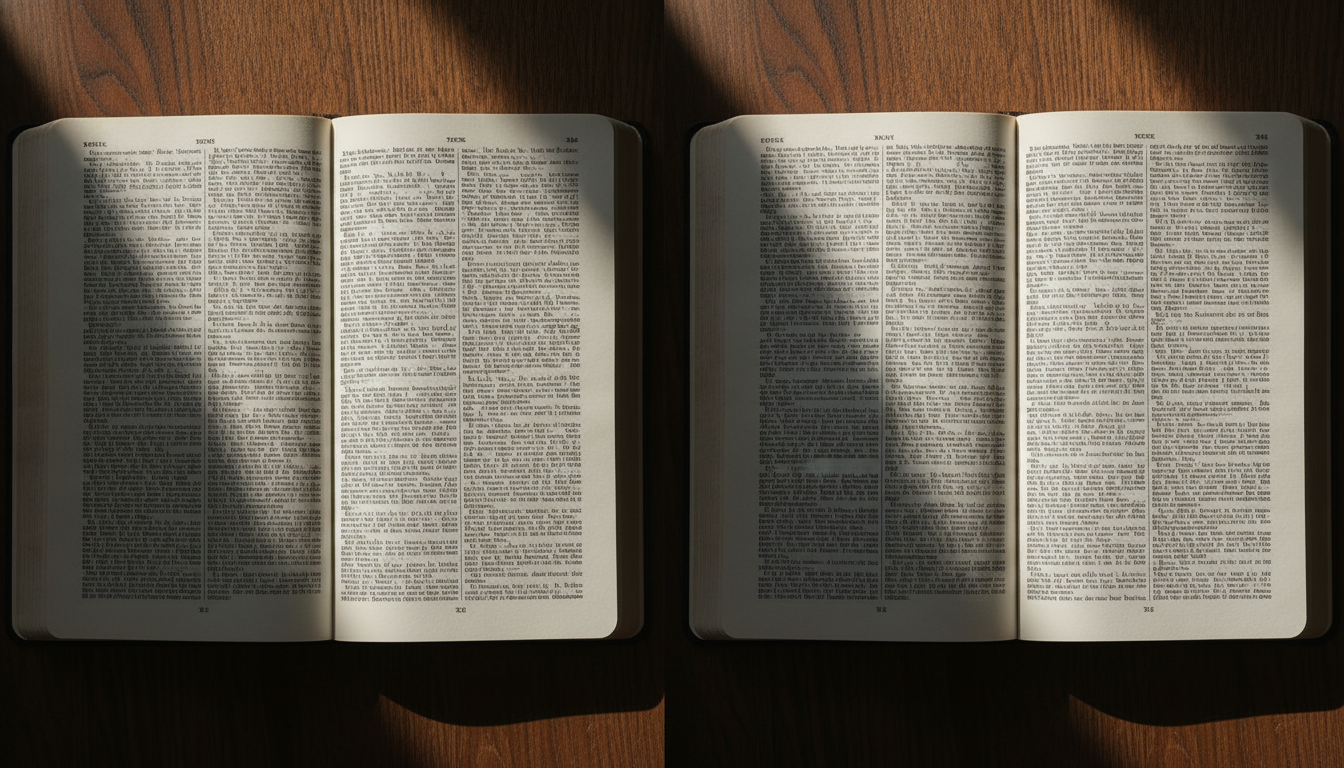
Yes, line matching completely eliminates distracting ghosting by precisely aligning the print grid of the front page with the print grid on the back of the page. This structural symmetry ensures that the shadows of letters printed on the reverse side are hidden directly behind the active-side letters. Implementing this advanced typesetting technique is critical when using a thin bible font on lightweight, low-GSM paper.
How does front-to-back symmetry improve contrast?
Front-to-back symmetry improves contrast by keeping the delicate white spaces between your lines of text free from distracting reverse-side shadows. When back-printed text is misaligned, its shadows fill the white leading gaps, creating a grey, low-contrast background.
- High text-to-paper contrast reduces eye strain and speeds up reading.
- It makes thin, lightweight papers look and feel far more premium.
- Clearer white channels enhance the legibility of small character details.
What technical precision is required for matching?
Achieving flawless line matching requires sophisticated typesetting software and high-precision mechanical printing presses that maintain absolute paper tension. Even a half-millimeter drift during high-speed printing will break the symmetry and cause visible shadow clutter.
- Typesetters must lock all text onto an absolute, document-wide baseline grid.
- Press operators must use automated, active-register control systems.
- Partnering with a specialized Bible manufacturer ensures your layout is executed perfectly.
Key Takeaway: Line matching is a premium manufacturing standard that transforms low-GSM paper editions into crisp, high-contrast literary masterpieces.
| Alignment Type | Ghosting Visibility | Reading Friction | Manufacturing Complexity | |
|---|---|---|---|---|
| Unmatched Grid | High / Distracting | Significant | Minimal | |
| Standard Matched Grid | Low / Soft | Minimal | Moderate | |
| Precision Locked Grid | Near Invisible | Zero | High (Requires elite press) |
The table indicates that utilizing a precision-locked baseline grid is the most effective defense against paper transparency and visual noise.
What Is the Optimal Line Length for Continuous Reading?
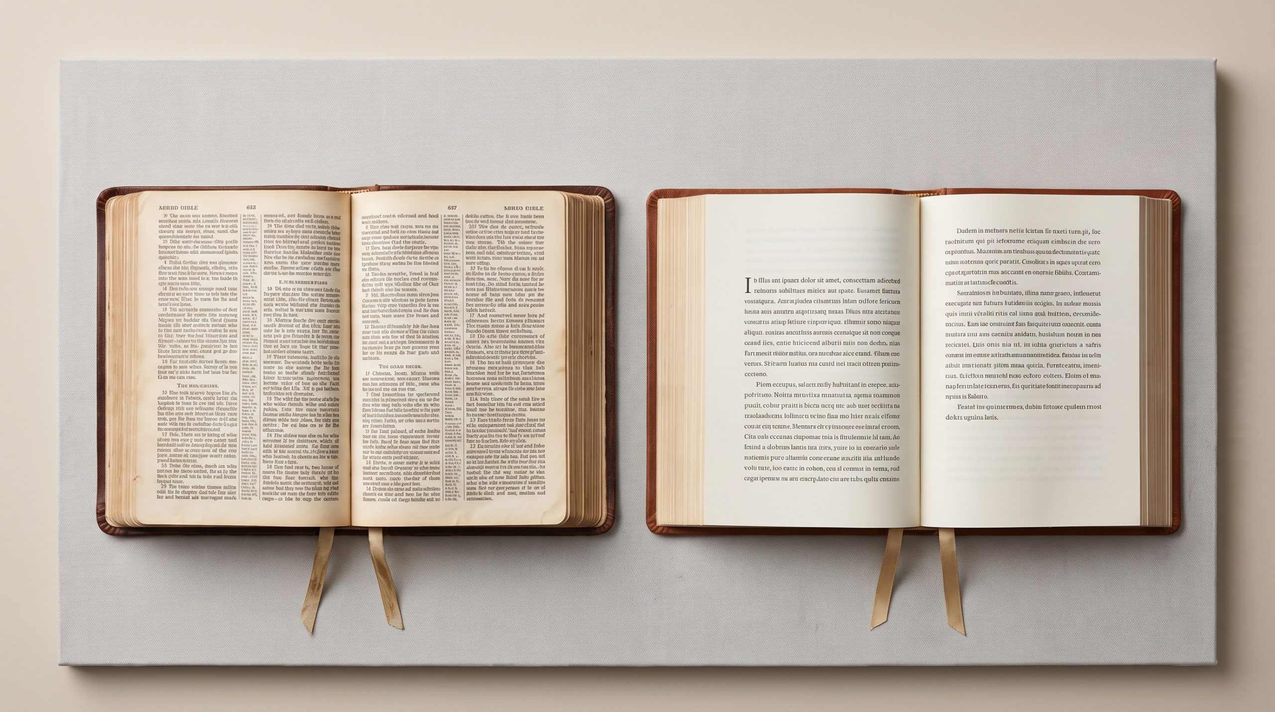
The optimal line length for continuous reading is between 45 and 75 characters per line, which equals roughly two and a half alphabets. This classic typographic measurement guarantees that the reader’s eye can glide across a line of text and return to the start of the next line without getting lost. Failing to respect this boundary with your chosen bible font will cause immediate fatigue and disrupt the visual flow.
Why is the two-and-a-half alphabets rule crucial?
The two-and-a-half alphabets rule is crucial because it aligns perfectly with the natural span of human horizontal eye movement. It helps prevent the reader from experiencing visual disorientation when tracking text.
- Lines that are too long make finding the beginning of the next line exhausting.
- Lines that are too short disrupt reading speed with too many line-breaks.
- Standardizing this length creates a comfortable reading rhythm.
Double column versus single column: which is best?
Choosing between double-column and single-column layouts depends on whether you prioritize physical space economy or a modern literary feel. Double-column layouts keep line lengths short and fit more text per page, while single-column layouts offer a premium, novel-like reading experience.
- Double columns are highly efficient for dense study editions.
- Single columns are perfect for journaling and reader-focused Bibles.
- Both structures require customized line length boundaries to protect readability.
Key Takeaway: Tailoring your layout format to match the target reading style ensures maximum continuous comprehension and product appeal.
| Layout Style | Average Characters / Line | Best Application | Space Efficiency | |
|---|---|---|---|---|
| Double Column | 45 – 55 characters | Reference & Pew Bibles | High / Economical | |
| Single Column | 60 – 75 characters | Devotional & Journaling | Medium / Premium | |
| Wide Format | 80+ characters | Oversized Art Books | Low / Specialty |
Analyzing these metrics shows that double-column layouts remain the champion of print economy, whereas single-column formats win on modern design appeal.
How Do Generous Margins Transform the Reading Experience?
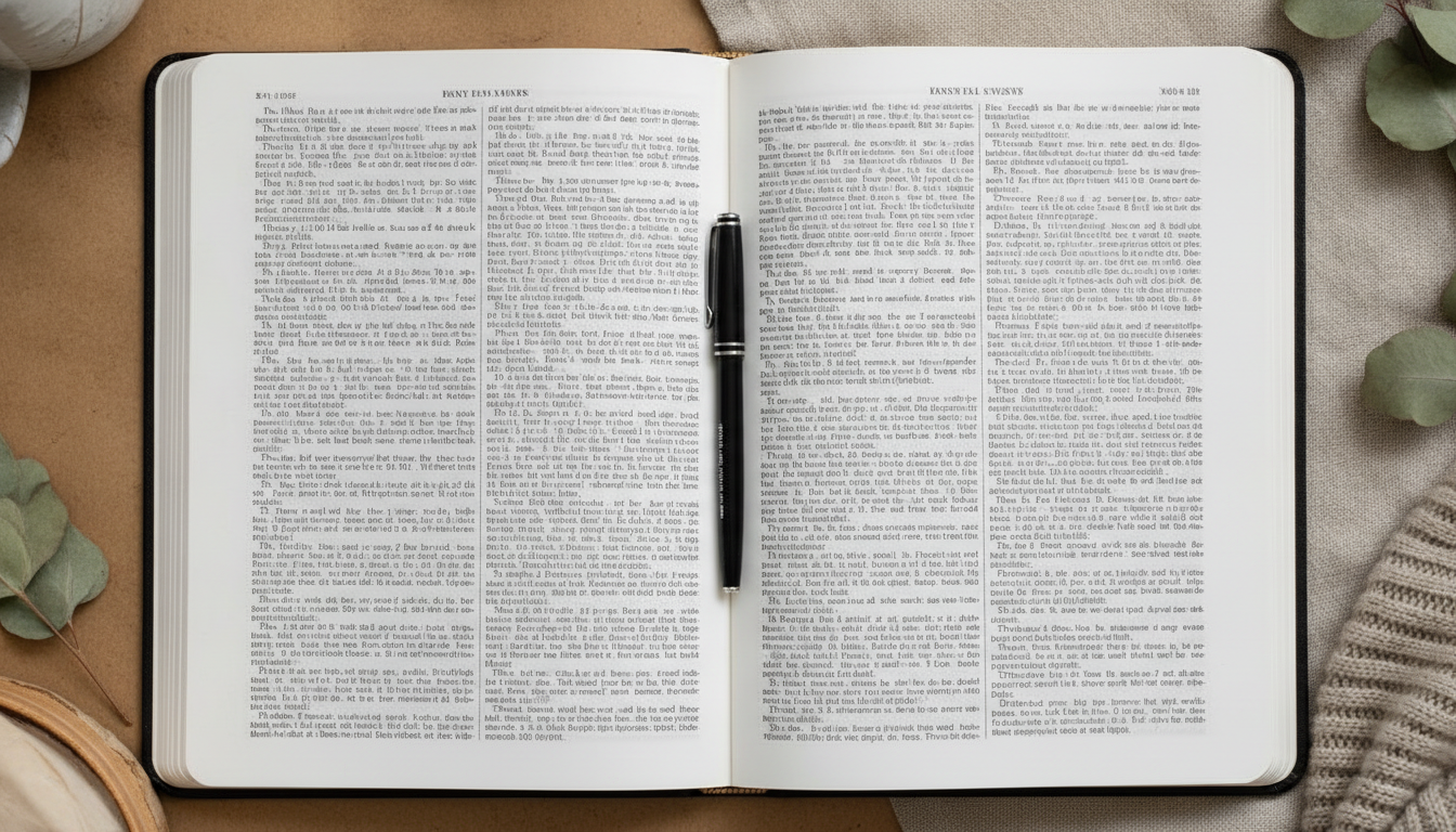
Generous margins transform the reading experience by framing the scripture in a beautiful resting zone for the eyes and preventing text from getting lost in the inner book gutter. Providing spacious margins around your bible font gives the reader’s thumbs a natural place to hold the volume without covering up the text. This elegant border separates the sacred words from the surrounding room, drawing the reader’s focus deeper into the layout.
Why do margins prevent gutter-swallowed text?
Wider inner margins prevent text from curving deep into the book binding, keeping all words on a flat, easily readable plane. When text is swallowed by the gutter, readers must physically strain the book’s spine to read.
- Flat-reading pages dramatically improve visual scanning.
- Proper gutter planning protects the thread sewing of the binding.
- It ensures that words are never distorted by the natural curve of the page.
How do journaling margins create premium value?
Journaling margins create premium value by offering wide, blank white columns that invite the reader to interact with the text by writing personal reflections and notes. This personal connection turns standard print editions into treasured personal heirlooms.
- Wide margins allow publishers to market Bibles as interactive journals.
- These specialty editions command a significantly higher retail price.
- They provide ample room for the layout to breathe, making the book look luxurious.
Key Takeaway: Designing with generous outer and inner margins is a highly effective way to elevate a standard print run into a high-value premium edition.
| Margin Profile | Outer Margin (mm) | Gutter Margin (mm) | Target Edition | |
|---|---|---|---|---|
| Compact / Slim | 10mm – 12mm | 14mm – 16mm | Pew & Travel Bibles | |
| Classic Study | 15mm – 18mm | 20mm – 22mm | Standard Reference Bibles | |
| Wide-Margin | 35mm – 50mm | 28mm – 32mm | Journaling & Premium Editions |
The margin width profile highlights that increasing page borders directly corresponds to higher consumer engagement and product value.
How Do Letter and Word Spacing Prevent Text Crowding?
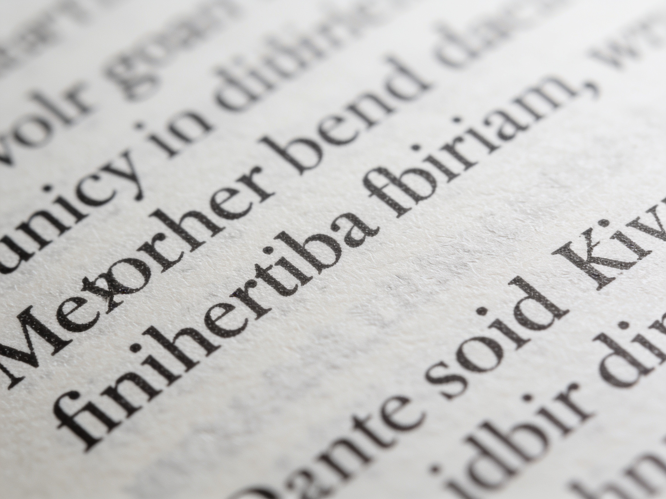
Proper letter and word spacing prevent text crowding by maintaining individual character shapes and clear word boundaries so that sentences do not turn into illegible lines of ink. When printing dense scriptures at tiny scales, these micro-adjustments ensure that your bible font remains sharp and legible. Without careful spacing controls, letters can bleed together on thin paper, causing serious eye strain.
Why must letters avoid touching in micro-printing?
Letters must avoid touching in micro-printing because any contact between characters causes their shapes to merge, completely destroying legibility on lightweight, high-absorbency paper. This issue is particularly severe with the delicate serifs of small typefaces.
- Touching characters make it incredibly difficult for the brain to recognize words.
- Open spacing prevents ink from bridging the gaps between characters.
- It ensures that even thin letters maintain their distinct shapes under high print pressure.
What happens when word spacing is inconsistent?
Inconsistent word spacing disrupts reading speed by creating awkward white gaps or dense, hard-to-read clusters of words. This layout issue is usually caused by poorly configured justification settings in typesetting software.
- Balanced word spacing creates a steady, comfortable reading speed.
- Inconsistent spacing creates distracting “rivers” of white space down the page.
- Micro-adjustments to spacing parameters keep the visual weight of the page uniform.
Key Takeaway: Fine-tuning letter and word spacing parameters is vital to protect legibility on highly absorbent, ultra-thin Bible paper.
| Spacing Attribute | Optimal Tolerance | Incorrect Settings Result | Readability Impact | |
|---|---|---|---|---|
| Letter Spacing | +1.5% to +2.5% | Crowded, touching letters | High reading fatigue | |
| Word Spacing | 95% to 105% standard | Uneven text blocks, “white rivers” | Distracted tracking | |
| Margin Spacing | Proportional | Off-center text alignment | Unprofessional aesthetic |
The table illustrates that maintaining precise spacing standards prevents layout defects, ensuring clean rendering under challenging press conditions.
Why Is Precise Kerning Critical for Compact Layouts?
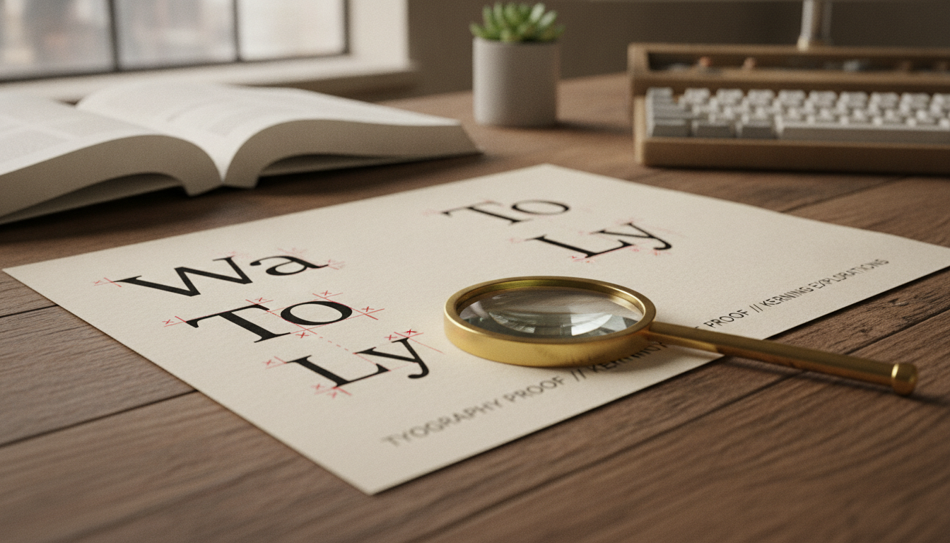
Precise kerning is critical for compact layouts because it manually adjusts the white space between specific letter pairs to ensure visual balance without sacrificing valuable page space. When fitting millions of characters into a thinline layout, every fraction of a millimeter counts, making an optimized bible font with custom kerning tables absolutely essential. This micro-level detailing ensures that problematic letter pairings always look uniform.
How does manual kerning solve awkward letter pairings?
Manual kerning solves awkward letter pairings by correcting default spacing values for character combinations that naturally look too far apart or too close together. This painstaking work creates a seamless, balanced visual texture across the entire page.
- Characters like ‘Yo’, ‘Ta’, and ‘We’ naturally leave distracting white gaps.
- Custom kerning pulls these letters together for a cohesive look.
- It eliminates jarring visual gaps that draw the reader’s attention away from the text.
Can kerning reduce overall Bible page counts?
Yes, professional kerning can reduce overall Bible page counts by optimizing character density across millions of letters. Over a massive text like the Bible, minor adjustments yield massive paper savings.
- Shaving a fraction of a millimeter per character saves entire pages.
- Decreasing the page count lowers raw material and shipping costs.
- Customizing a typeface pays for itself in manufacturing efficiency.
Key Takeaway: Investing in custom kerning tables improves visual quality and delivers significant printing cost savings across large print runs.
| Kerning Method | Application Method | Visual Texture | Page Count Impact | |
|---|---|---|---|---|
| Standard Metric | Automatic software | Irregular spacing gaps | 0% (Baseline) | |
| Optical Alignment | Algorithmic calculation | Improved consistency | Minor (Saves 1% – 2%) | |
| Bespoke Manual | Custom designer-refined | Perfectly balanced | High (Saves up to 5%) |
Reviewing the kerning options proves that custom manual refinements are highly effective for reducing page counts and optimizing production budgets.
How Do Paper Weight and Opacity Affect Readability?
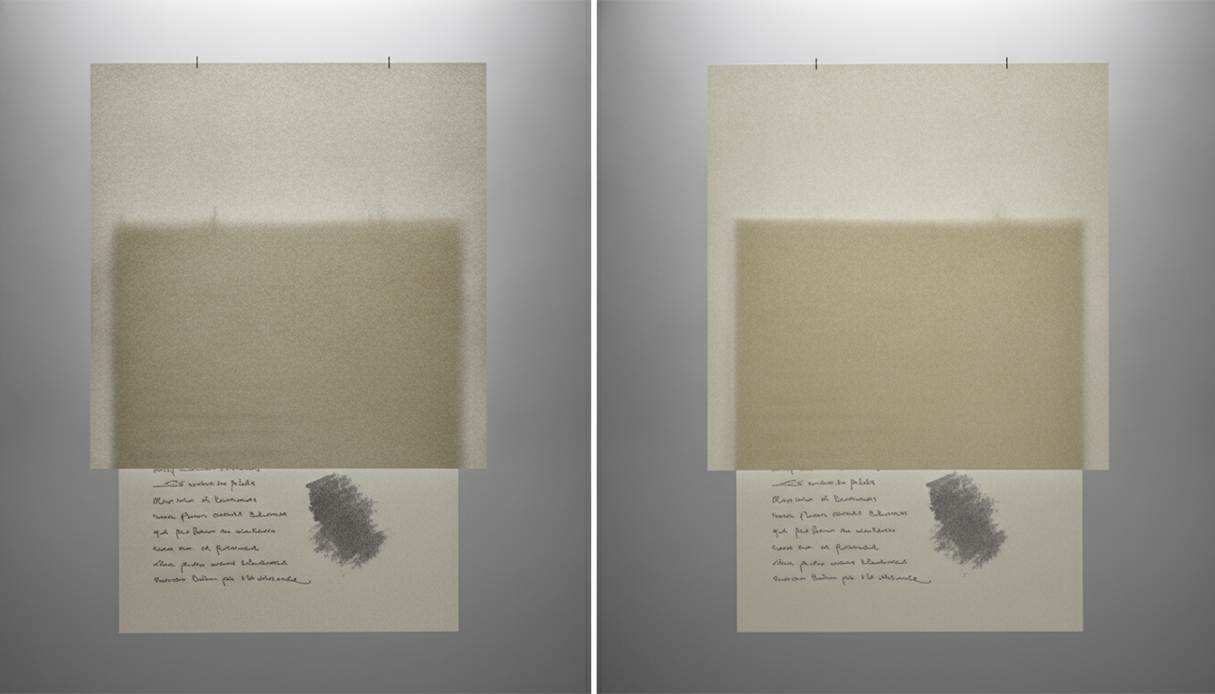
Paper weight and opacity directly affect readability by controlling the physical level of ghosting and determining the contrast ratio between ink and the page background. When printing scriptures, selecting a paper grade that matches the visual weight of your bible font is crucial to prevent text shadows from showing through. The thinner the paper, the higher the raw opacity required to maintain a clean background.
What GSM is required to minimize ghosting?
To minimize ghosting on lightweight pages, a paper weight of at least 28 GSM to 36 GSM is required, combined with premium high-opacity mineral fillers. Standard trade books use thicker papers, but Bibles require thin, highly opaque sheets to remain portable.
- Titanium-filled papers maintain high opacity even at low weights.
- It allows publishers to produce thick study editions that remain easy to carry.
- It ensures that reverse-side text shadows do not muddy the white spaces.
How do coating and color tone improve page contrast?
Matte coatings and warm off-white, cream, or ivory page tones improve contrast by reducing harsh light glare and softening the visual environment. High-gloss, bright-white papers reflect too much light and quickly tire the reader’s eyes during study.
- Off-white tones deliver a warm, classic aesthetic that feels premium.
- Matte coatings ensure that the ink sits sharply on the page surface without spreading.
- Soft page backgrounds make character shapes stand out with crisp clarity.
Key Takeaway: Choosing high-opacity, matte-coated, cream-toned paper is essential to eliminate ghosting and maximize reading comfort.
| Paper Weight (GSM) | Typical Opacity % | Shadow Ghosting Level | Recommended Bible Application | |
|---|---|---|---|---|
| 22 GSM – 24 GSM | 76% – 79% | High | Pocket & Compact Editions | |
| 28 GSM – 32 GSM | 81% – 85% | Minimal (with matched lines) | Standard Text & Pew Bibles | |
| 36 GSM – 40 GSM | 86% – 90% | Negligible | Premium Study & Wide-Margin |
The opacity comparison table demonstrates that premium mineral-filled papers are necessary to maintain clear text contrast on lightweight sheets.
Why Partner With Kingtai for Premium Bible Printing?
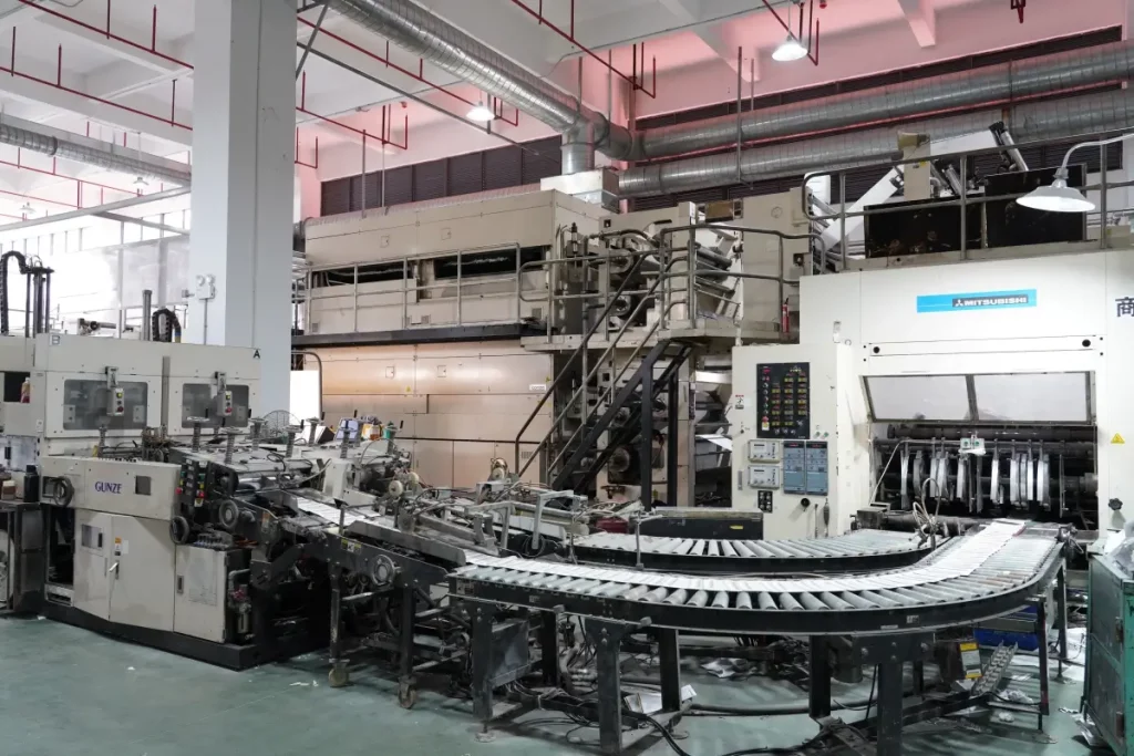
Partnering with Kingtai for premium Bible printing guarantees that your sophisticated layouts, thin-paper runs, and complex binding specifications are executed with flawless precision by a world-class manufacturing specialist. We possess the unique expertise and state-of-the-art machinery required to render your chosen bible font with absolute crispness and clarity. Our specialized facility handles every step of production with rigorous quality controls.
How does Kingtai guarantee flawless line matching?
Kingtai guarantees flawless line matching by utilizing advanced high-register printing presses equipped with automated, real-time laser alignment systems. This technology completely eliminates paper stretch and grid drift during high-speed runs.
- Our system locks the front and back pages in perfect alignment.
- We continuously monitor paper tension on lightweight, low-GSM sheets.
- It prevents misaligned shadow clutter, ensuring a clean reading surface.
What custom binding options elevate the final product?
Kingtai offers premium custom binding options, including hand-stitched Smyth sewing, edge-lined goatskin covers, and elegant gilt-edged page finishes. These luxury details turn standard print editions into prized heirloom items.
- Smyth-sewn bindings allow the Bible to lay perfectly flat when opened.
- Hand-picked leathers provide a tactile luxury that attracts premium buyers.
- Our custom finishes raise the retail value of your product portfolio.
Key Takeaway: Partnering with Kingtai ensures your complex typesetting layout choices are matched by flawless industrial execution and luxury binding techniques.
| Kingtai Specialty | Machine Capability | Quality Performance | Key B2B Value | |
|---|---|---|---|---|
| Line Matching | Auto-Register Presses | Pinpoint grid lock | Completely eliminates ghosting | |
| Thin Paper Control | Active-Tension Web Presses | No tearing or wrinkles | Maximizes production efficiency | |
| Smyth-Sewn Binding | Automatic Thread Stitches | Lay-flat structural flex | Delivers luxury heirloom quality |
Our specialized manufacturing capabilities translate your complex design specifications into stunning, durable, and highly readable physical Bibles.
Elevate Your Next Scripture Project with Kingtai
Bringing a premium Bible to market requires an absolute commitment to detail, from the micro-typographic layout to the final leather binding. At Kingtai, we blend advanced printing technology with world-class craftsmanship to turn your design vision into a durable, highly readable masterpiece that readers will cherish for generations. Our team is ready to guide you through paper selection, layout optimization, and luxurious finishing options to ensure your publication meets the highest market standards. To get a custom quote and begin your production journey with an industry-leading manufacturer, we invite you to contact us today .
Frequently Asked Questions
Can I use standard book layout software for Bible typesetting?
Yes, but you will need specialized, baseline-locked grids and custom settings to handle line matching and complex multi-column layouts. Standard settings lack the precision required for low-GSM, ultra-thin papers, making professional micro-adjustments highly necessary.
What’s the best paper weight for a standard travel Bible?
A weight between 28 GSM and 32 GSM is the ideal industry standard. This range provides excellent durability and opacity while keeping the finished volume lightweight and highly portable.
How do I know if my chosen font is suitable for thin Bible paper?
Check the font’s x-height and counter openings under a magnifying glass or print proof sheet. If the internal spaces of letters like ‘e’ and ‘a’ look tight, the characters will likely blur and pool ink during high-speed press runs.
Can I request custom leather bindings and page edge gilding directly from Kingtai?
Yes, Kingtai provides a complete suite of custom premium binding services, including edge-lined goatskin and gold foil page gilding. Our craftsmen specialize in translating your design requirements into luxurious, highly durable physical products.