
Perfect packaging box design is the art and science of combining structural integrity, brand aesthetics, and clear product information to create a powerful physical representation of your brand. Many retail brands struggle to get their products noticed on crowded shelves, wasting thousands of dollars on generic, uninspiring containers. If your packaging looks cheap or fails to protect your merchandise during transit, you will suffer from high product return rates, poor customer reviews, and ultimately lost sales to competitors who invest in their presentation. Fortunately, learning how to design box packaging gives you the ultimate framework to craft beautiful, secure, and memorable custom boxes that elevate your brand and protect your products.
How to design box packaging that matches your brand?
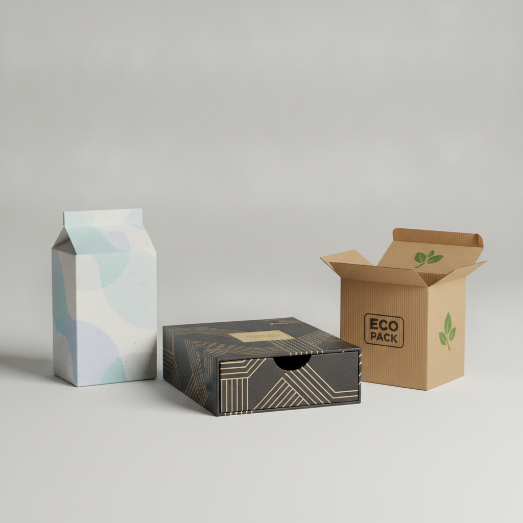
You can design custom box packaging that matches your brand by tailoring the structural shapes, physical dimensions, and visual elements to reflect your unique identity. Understanding how to design box packaging begins with recognizing that custom-tailored containers are much more than mere wrapping; they represent the primary physical touchpoint between your company and your customer. By choosing custom dimensions, you ensure your products remain snug, protected, and incredibly professional.
What are the main custom box styles?
Selecting the correct box style depends entirely on your product’s weight and retail display goals. Here is the deal: you must choose a structural template that balances protection and aesthetic appeal to make an unforgettable first impression. Ensure you choose from these popular industry styles:
- Folding Cartons: Lightweight options perfect for cosmetics, perfumes, and food items.
- Rigid Luxury Boxes: Sturdy, heavy containers designed for premium tech or jewelry.
- Corrugated Mailers: Durable boxes built specifically to handle direct-to-consumer e-commerce shipping.
How do primary and secondary packaging differ?
Primary packaging is the layer that directly touches your physical product, while secondary packaging groups and protects those primary containers. Think about it: if you sell organic oils, your primary packaging is the glass bottle, but your secondary packaging is the beautifully printed paperbox that guards the bottle. Utilizing both layers correctly offers several key business benefits:
- Double Layer Protection: Prevents inner liquids or fragile materials from breaking.
- Cohesive Unboxing: Allows you to tell a tiered, premium story as the customer unfolds each layer.
Key Takeaway: Choosing the right packaging style and separating your primary and secondary layers ensures your products stay safe while presenting a polished, high-end retail look.
| Packaging Level | Direct Contact | Primary Function | Common Materials | |
|---|---|---|---|---|
| Primary Packaging | Yes | Product containment & preservation | Glass, plastic, thin cardstock | |
| Secondary Packaging | No | Shipping, stacking, & visual branding | Corrugated fiberboard, thick rigid board |
This systematic division reveals how selecting appropriate layer hierarchies protects your inventory and boosts retail shelf appeal.
Why is learning how to design box packaging crucial?
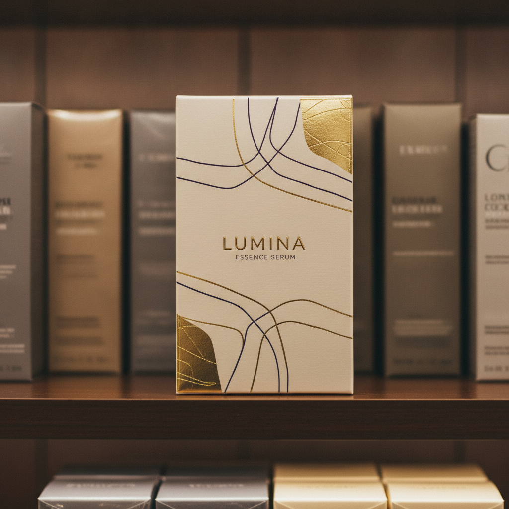
Learning how to design box packaging is crucial because professional packaging serves as a silent salesperson that directly impacts retail purchasing decisions within seconds of a buyer’s glance. When you master this discipline, you gain the power to elevate your merchandise from an overlooked commodity to a premium, sought-after luxury item. Failing to prioritize your box layouts will inevitably lead to your products getting ignored on crowded shelves in favor of competitor brands.
Can physical box layouts drive customer purchases?
Your packaging’s overall layout is the fastest way to drive customer purchasing behavior and build trust in a physical retail store. Think about it: research indicates that over one-third of consumer decision-making is based entirely on how attractive a package looks. You should focus on these high-converting visual elements to instantly hook shoppers:
- Spot UV Gloss Coatings: Highlights your logo by catching the ambient store light.
- Tactile Matte Finishes: Feels incredibly soft, warm, and high-end to the touch.
- Contrast Color Blocking: Separates your products visually from surrounding bland designs.
How does premium packaging build long-term brand value?
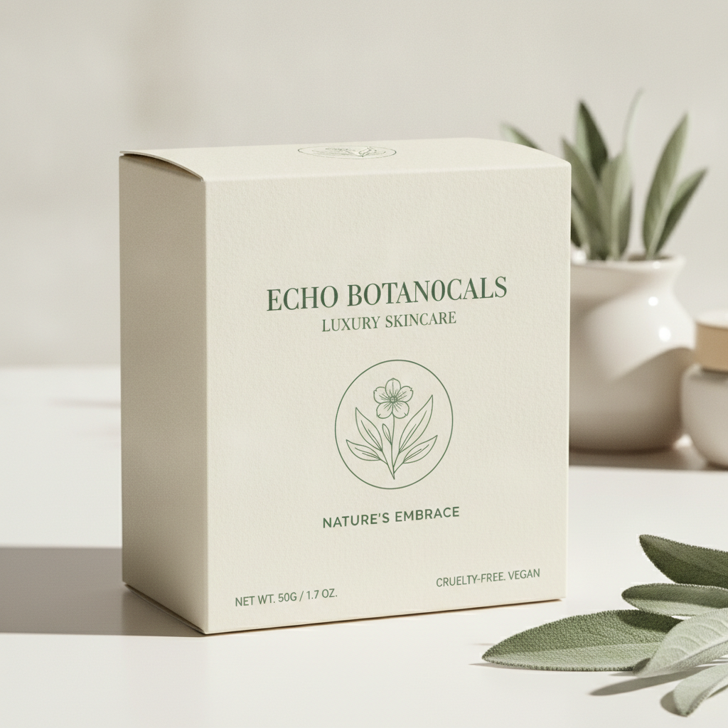
Investing in high-quality boxes establishes deep brand authority and turns one-time shoppers into passionate brand advocates. Here is the deal: when you present your merchandise in a sturdy, premium container, customers naturally assume your physical product inside is of equally superior quality. Developing an outstanding layout helps you unlock these key advantages:
- High Perceived Value: Justifies premium pricing strategies for your entire product catalog.
- Organic Social Sharing: Inspires buyers to record and share their unboxing experiences online.
Key Takeaway: Elevating your packaging’s physical aesthetics directly drives retail sales, justifies premium pricing, and boosts overall customer retention.
| Presentation Quality | Consumer Perception | Financial Result | |
|---|---|---|---|
| Premium Finishes | Superior quality, trustworthy brand | Higher margins and repeat purchases | |
| Generic Design | Low value, cheap knockoff | High cart abandonment and discount dependency |
This clear distinction demonstrates how investing in premium visual details translates directly into stronger retail margins and brand loyalty.
What are the basics of how to design box packaging?
The core technical basics of how to design box packaging include setting up your workspace in the correct CMYK color space, choosing vector design software, and understanding how 2D flat drawings fold into 3D boxes. Knowing how to design box packaging requires a shift from web design thinking to physical print preparation to ensure your final printed colors match what you see on your computer screen. Skipping these basic color and design rules can result in blurry graphics, distorted logos, and costly manufacturing delays.
Why must you use CMYK instead of RGB color modes?
Physical printing presses require CMYK files because screens and paperboard create colors using completely different methods. Best of all? Setting up your documents in CMYK from the very start prevents unexpected, ugly color shifting once your boxes are printed. Keep these rules in your design workflow:
- Always Choose CMYK Mode: Sets your layout documents up for standard press ink systems.
- Utilize Pantone Matching System: Guarantees absolute color consistency for your brand’s official logo.
- Never Rely on Screen Previews: Understand that monitors always show colors brighter than printed paperboard.
Which digital software should you use for packaging?
Vector-based programs like Adobe Illustrator are the mandatory gold standards for drafting professional custom packaging boxes. Think about it: vectors allow you to scale your shapes and text to any size without losing sharpness, unlike pixel-based programs that blur. You can build a highly professional toolkit by using these programs:
- Adobe Illustrator: Unmatched for clean typographic layout and drafting precise vector lines.
- Adobe Photoshop: Best for deep color correction and editing high-resolution lifestyle product photos.
- 3D Render Software: Perfect for viewing your flat 2D designs as a fully folded 3D mockup.
Key Takeaway: Working in CMYK color modes with vector-based software is critical to ensuring your physical boxes print clearly and look professional.
| Color System / File Type | Main Function | Printing Compatibility | |
|---|---|---|---|
| CMYK Vector Files | Physical press plates | Mandatory for sharp, accurate print outputs | |
| RGB Pixel Files | Digital screen displays | Unusable for high-quality box manufacturing |
Preparing your graphics using correct color modes and vector files keeps your custom packaging projects moving forward efficiently.
How to design box packaging with the best materials?

You can choose the best materials when discovering how to design box packaging by matching the weight, fragility, and distribution method of your product with the appropriate paperboard thickness and stiffness. Selecting the right physical board acts as the foundational layer of your packaging, determining how well your item survives rough shipping and sits on retail shelves. Making the wrong choice can lead to collapsed boxes, torn paper, and damaged items, which ultimately costs your brand money and trust.
Should you choose paperboard or corrugated board?
Your material choice should be based on whether your product goes directly onto retail shelves or travels through parcel shipping networks. Here is the deal: lightweight retail cosmetics look stunning in sleek paperboard, but heavy e-commerce shipments require the tough, fluted protection of corrugated cardboard. Select your material based on these distinct industry options:
- SBS Paperboard: Smooth, clean white surface perfect for high-resolution graphics and luxury retail displays.
- Corrugated Cardboard: Thick, shock-absorbing fluted layers designed for shipping mailers and subscription boxes.
- Kraft Board: Earthy, brown, highly tear-resistant paperboard ideal for organic, eco-friendly brands.
How do paperboard thickness measurements work?
Paperboard thickness is measured in points, where each point represents one-thousandth of an inch of material height. Think about it: using a box that is too thin will cause the packaging to sag and bend under the physical weight of your item. You can choose the correct thickness by following these basic rules of thumb:
- 16pt to 18pt Cardstock: Great for lightweight products like small cosmetics, soaps, or tea bags.
- 20pt to 24pt Cardstock: Perfect for medium-weight retail items like hardware, perfumes, or glassware.
- E-Flute Corrugated: Outstanding choice for direct shipping boxes that require extra crush resistance.
Key Takeaway: Matching your material’s thickness and fluting to your product’s weight prevents shipping damage and ensures a premium presentation.
| Material Class | Thickness Range | Primary Application | Key Aesthetic | |
|---|---|---|---|---|
| SBS Paperboard | 16pt – 24pt | Retail shelves, cosmetic boxes | Smooth, ultra-clean, high contrast | |
| Corrugated Board | E-Flute to B-Flute | Shipping boxes, subscription mailers | Textured, sturdy, protective |
Selecting the correct cardboard weight guarantees structural safety while maintaining a professional look for your products.
How to design box packaging using vector dielines?
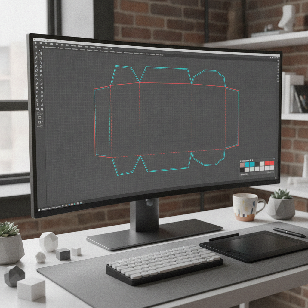
You can design highly accurate dielines by creating a flattened 2D vector drawing that serves as the precise blueprint for cutting, folding, and printing your custom packaging. When learning how to design box packaging , mastering these technical layouts is critical because a single misaligned line can cause your artwork to print off-center or make the physical box impossible to fold. These dieline files tell manufacturing cutting machines exactly where to score, cut, and crease your paperboard during mass production.
Do you know the standard dieline color codes?
Using industry-standard color codes on separate vector layers ensures that your manufacturing partner folds and cuts your box accurately. Here is the deal: if you do not separate your fold lines from your cut lines using color codes, the cutting machines might accidentally slice your box in half. Make sure you organize your digital artboards with these standard colors:
- Solid Red Lines: Tells the cutting blade exactly where to slice the paperboard.
- Dashed Blue Lines: Tells the scoring wheels where to fold and crease the box flaps.
- Green Dotted Lines: Marks the outer bleed boundaries for your background graphics.
Why are bleed and safety margins absolutely vital?
Bleed and safety margins protect your final design from shifting slightly on the printing press during high-speed production runs. Best of all? Adding these margins prevents unsightly raw white paper borders from showing along the trimmed edges of your finished boxes. Always apply these critical technical dimensions to your dieline canvas:
- 1/8 Inch Artwork Bleed: Extend your background colors past the red cut line to cover paper shifting.
- 1/8 Inch Safety Zone: Keep all vital text and logos inside the blue fold lines so they do not get creased.
Key Takeaway: Setting up your vector dielines with accurate color codes, bleed margins, and safety zones ensures error-free manufacturing.
| Vector Layer Line | Color Code | Action Required by Machine | Safe Margin Distance | |
|---|---|---|---|---|
| Cut Line | Solid Red | Slices paperboard outline | 1/8 Inch past fold lines | |
| Fold Line | Dashed Blue | Creases/scores flaps | 1/8 Inch inside safety |
This precise blueprint setup guarantees that your digital graphics transition flawlessly into structured physical boxes.
How to design box packaging for secure shipping?
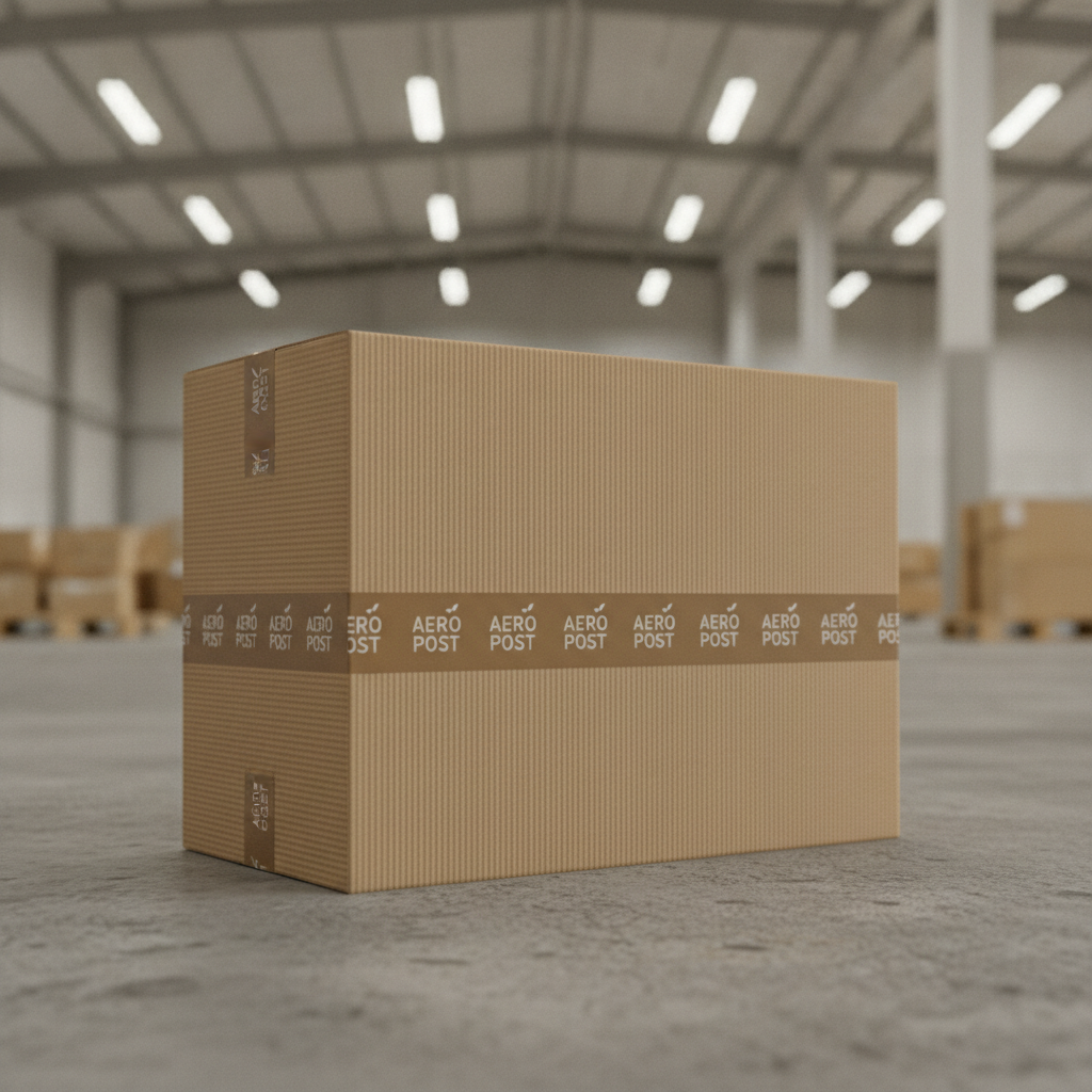
You can secure your goods for transit by choosing how to design box packaging with built-in locking tabs, sturdy corrugated walls, and custom-fit interior inserts that prevent your items from moving during shipping. Protecting your merchandise during transit is just as important as the external visual layout of your box. Investing time into engineering protective structures prevents costly product damage, eliminates customer returns, and ensures a flawless unboxing experience.
Should you invest in custom box inserts?
Custom-fit inserts are molded precisely to the shape of your products, keeping fragile items from shaking and breaking during transport. Think about it: if a customer opens your box only to find shattered glass or dented parts, they will immediately lose faith in your brand. Select the ideal protective inner material based on your budget and fragile needs:
- Molded Paper Pulp: Extremely eco-friendly, affordable, and provides excellent shock absorption for jars.
- EVA Foam Inserts: High-end, premium look and feel, making them perfect for luxury electronics and cosmetic bottles.
- Corrugated Dividers: Simple, cost-effective cardboard grids designed to separate multiple glass bottles.
What are the benefits of secure locking tabs?
Built-in locking tabs keep your shipping box securely shut without needing messy, excessive packing tape that ruins your presentation. Here is the deal: designing a self-locking mailer box keeps your packaging looking incredibly clean while speeding up your order fulfillment process. Integrate these smart structural designs to improve your e-commerce operations:
- Dust Flaps: Block dirt and moisture from entering the box during long transit journeys.
- Cherry-Lock Ear Tabs: Snap firmly into the sides of mailers to prevent accidental opening.
Key Takeaway: Combining custom-fit structural inserts with secure locking tabs protects your products during shipping while preserving a beautiful unboxing experience.
| Insert Material | Protective Level | Eco-Friendliness | Primary Target Industry | |
|---|---|---|---|---|
| Molded Pulp | Medium-High | Highly biodegradable | Organic skincare, food jars | |
| EVA Foam | Maximum | Recyclable but non-green | Luxury cosmetics, premium tech |
Integrating robust interior supports into your box design ensures your products survive the rigors of global transit.
How to design box packaging with strategic colors?
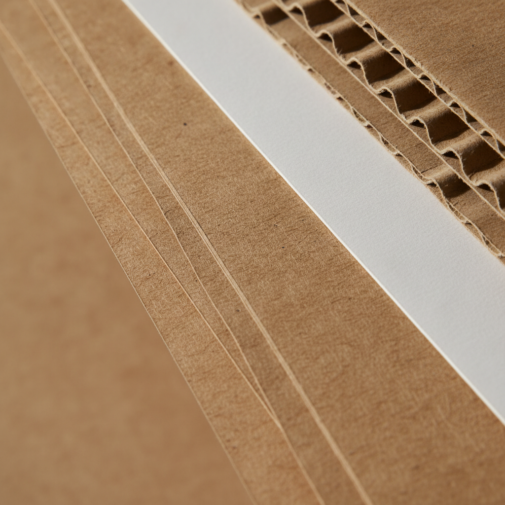
You can use strategic colors on your box packaging by using color psychology to trigger immediate emotional connections and communicate your brand’s unique personality without words. When discovering how to design box packaging , selecting your color palette is one of the most powerful ways to influence consumer buying behavior and stand out in stores. Choosing the wrong color scheme can send confusing messages to your target audience and make your brand look unprofessional.
What emotions do different packaging colors trigger?
Different colors trigger instant psychological responses that shape how customers perceive your product’s quality, price point, and safety. Think about it: using a clean, soft pastel palette sends an entirely different brand message than using a bold, glossy neon scheme. Match your color choices with these proven retail psychological triggers:
- Matte Black: Communicates high-end luxury, mystery, and premium exclusive value.
- Minimalist White: Suggests modern simplicity, hygiene, clean ingredients, and medical safety.
- Earthy Kraft Brown: Signals organic purity, eco-friendly sustainability, and rustic charm.
How should you balance colors for shelf standout?
Balancing high-contrast colors makes your boxes stand out from a distance on retail shelves crowded with competing brands. Best of all? Using strategic color blocking allows your brand logo to remain clean and readable even in low-light shopping aisles. Keep these design strategies in mind when finalizing your layout colors:
- 60-30-10 Rule: Use 60% dominant color, 30% secondary color, and 10% accent color for visual balance.
- Contrast Is Key: Ensure your text color stands out sharply against your background colors.
Key Takeaway: Leveraging strategic color psychology on your packaging establishes an instant, powerful emotional connection with your target buyers.
| Packaging Color | Psychological Signal | Best Retail Application | |
|---|---|---|---|
| Sleek Black | Luxury, premium, exclusive | High-end cologne, luxury tech | |
| Pastel Green | Calming, organic, healthy | Natural skincare, wellness vitamins |
Applying proven color psychology strategies ensures your packaging attracts the exact target audience you want.
How to design box packaging using great typography?
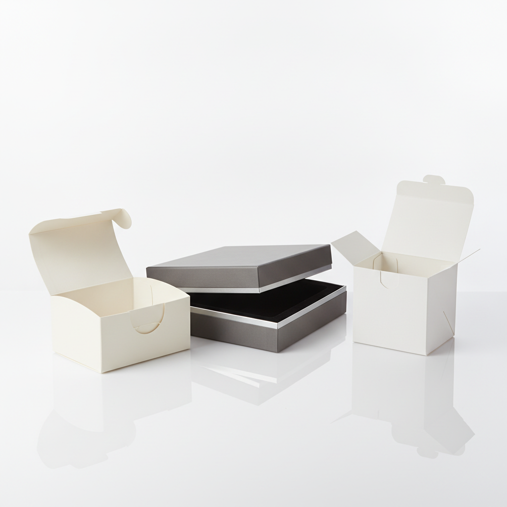
You can select the right typography when deciding how to design box packaging by choosing highly readable, high-contrast fonts that communicate your brand’s personality from several feet away. Font selection is critical to ensuring shoppers can quickly understand your product benefits, ingredients, and instructions. Utilizing hard-to-read, overly decorative fonts on your panels will cause potential buyers to ignore your products and purchase from a competitor instead.
How can you create a clear font hierarchy?
Creating a clear typographic hierarchy allows customers to read and scan your most important box information in less than two seconds. Here is the deal: you must use font weights, sizes, and styling to guide the buyer’s eye from the product title down to the key benefits. Organize your box text using these three fundamental structural layers:
- Primary Header: Bold, unique display font that showcases your brand name and logo style.
- Secondary Benefits: Clean sans-serif font listing your product’s top three selling points.
- Technical Copy: Small, highly legible font for directions, warning labels, and company details.
Why is readability more important than decoration?
While unique decorative fonts look beautiful, they often become completely illegible when scaled down and printed on small paperboard boxes. Think about it: if a customer cannot read your key features because of a confusing cursive font, they will simply put the product back. Protect your brand’s message by implementing these proven typography rules:
- High Contrast: Always print dark-colored fonts on light backgrounds, or white fonts on dark backgrounds.
- Minimum Font Size: Keep ingredients and warning panels at 6pt minimum to ensure clean print readability.
Key Takeaway: Structuring your box typography into a clean, highly readable font hierarchy makes your product benefits clear and persuasive.
| Font Family | Visual Tone | Best Use Case on Box | Readability Level | |
|---|---|---|---|---|
| Serif Fonts | Elegant, premium, traditional | Brand name and luxury product logos | High at larger sizes | |
| Sans-Serif Fonts | Modern, clean, professional | Ingredient lists and warning panels | Maximum legibility at small sizes |
Structuring your text with clean font pairings ensures your brand message remains readable and highly professional.
How to design box packaging to meet regulations?
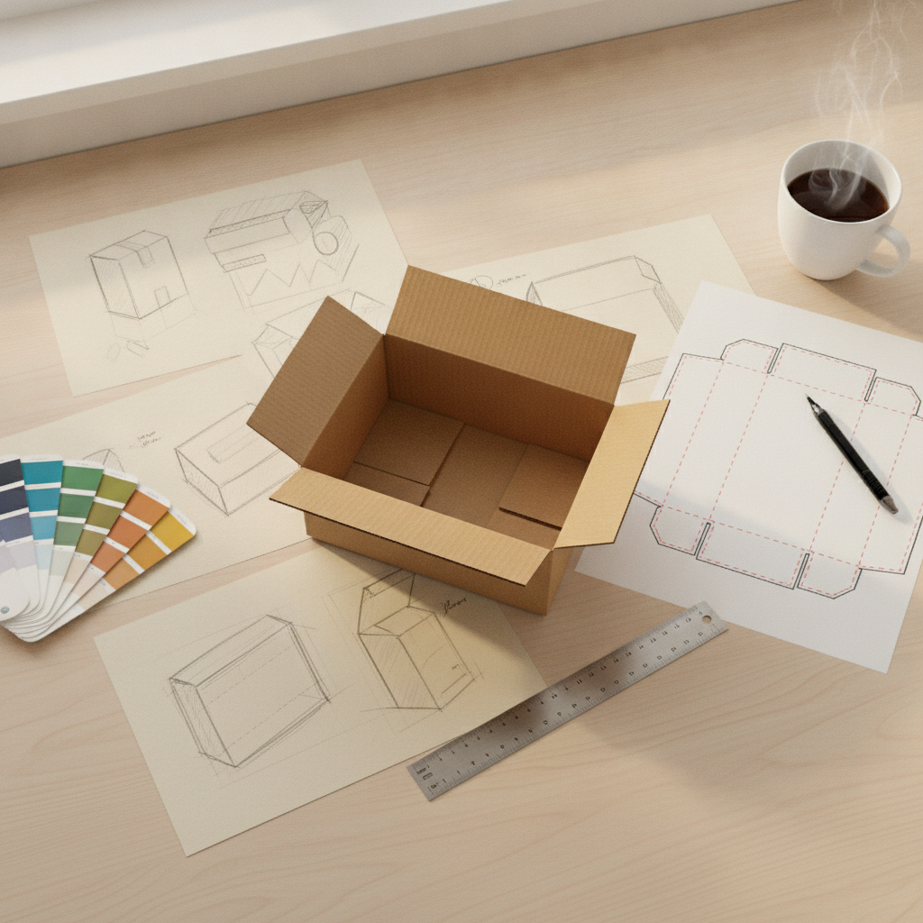
You can ensure your box design meets all legal requirements by placing required regulatory information, including ingredients, weight declarations, country of origin, and barcodes, on clear flat panels. When executing how to design box packaging , keeping compliance in mind is critical to preventing your products from being rejected by retailers, blocked by customs, or fined by government agencies. Integrating these required details early in your layout phase keeps your boxes legally compliant while maintaining a beautiful look.
Which compliance labels are required on boxes?
Different product categories require specific compliance labels and safety symbols to protect consumers and meet regional trade laws. Here is the deal: failing to include these required symbols can lead to costly product recalls and loss of customer trust. Ensure you research and place these necessary elements onto your side or back panels:
- Net Weight: Placed horizontally within the bottom third of the front display panel.
- Allergen Warnings: Printed in bold text to quickly alert consumers of health risks.
- Certification Badges: Marks like CE, FCC, recycling symbols, or organic farming certifications.
Where is the best place to print your barcode?
Barcodes must be printed on flat, smooth surfaces at standard dimensions to ensure retail scanner lasers can read them easily during checkout. Best of all? Integrating your barcode neatly on a rear or bottom panel prevents it from interrupting your front cover design. Keep these scan-ready rules in your layout template:
- Avoid Creases and Seams: Never print a barcode over a fold line, corner, or flap seal.
- High Contrast Background: Always print the black barcode lines on a solid white background box.
Key Takeaway: Placing required compliance labels and barcodes cleanly on back panels keeps your packaging beautiful, professional, and retail-ready.
| Compliance Element | Required Placement | Legal Purpose | Scanner Friendly | |
|---|---|---|---|---|
| Net Weight Label | Bottom third of front panel | Standardized consumer weight declaration | N/A | |
| UPC Barcode | Flat rear or bottom panel | Inventory management and fast checkout scanning | Highly required |
Including all mandatory safety and tracking elements keeps your brand compliant and ready for global retail shelves.
How to design box packaging and run quality checks?
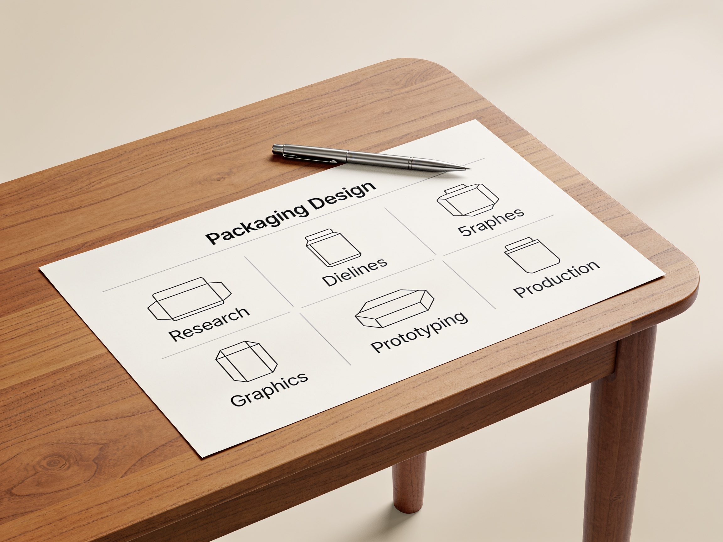
You can run effective quality checks on your box packaging by printing physical prototypes at 1:1 scale to verify measurements, flap tension, and color accuracy before moving to mass production. Testing how to design box packaging with hands-on models is the absolute best way to catch alignment mistakes before investing thousands of dollars in actual factory manufacturing. Spending extra time testing prototypes ensures your products fit perfectly, your text is readable, and your boxes fold easily.
Why must you print a 1:1 physical paper mockup?
While digital 3D mockups look incredibly lifelike on screens, only physical paper prototypes can prove that your box is structurally sound. Think about it: holding a physical mockup in your hands lets you test if your actual product slides in easily or if the flaps are too tight. Make sure you complete these physical quality checks:
- Verify Product Fit: Place your item inside the folded paper mockup to test its fit.
- Check Flap Tension: Ensure the closing flaps open smoothly without tearing or being too loose.
- Analyze Graphics Alignment: Verify that your background artwork transitions seamlessly across folded edges.
How can you double-check color accuracy?
You can guarantee color accuracy by reviewing a physical press proof under standardized lighting rather than relying on your glowing computer monitor. Here is the deal: monitors emit light, which makes digital images look much brighter and different from ink printed on matte paperboard. Follow these steps to ensure color consistency across your production:
- Request a Printer Proof: Ask your manufacturer for a physical print sample before starting mass production.
- Check Under Neutral Light: Always inspect your physical sample under neutral daylight to see the true colors.”
Key Takeaway: Testing both digital and physical prototypes is critical to catching layout errors early and avoiding expensive manufacturing mistakes.
| Prototype Type | Primary Assessment Goal | Critical Mistake Discovered | |
|---|---|---|---|
| Digital 3D Model | Checking text placement and seam alignment | Misaligned text on corners | |
| Physical Paper Sample | Testing paperboard weight and structural strength | Weak paperboard or loose folding flaps |
Completing thorough prototype checks ensures your custom packaging protects your product and looks amazing once printed.
Strategic Considerations
Designing the perfect custom packaging box is a vital step in elevating your brand’s retail presence, protecting your products, and driving customer loyalty. This guide has demystified the entire design journey—from choosing structural materials and mastering vector dielines to utilizing color psychology, selecting legible fonts, and testing physical prototypes. However, translating your creative design into high-quality, professional packaging requires the right manufacturing partner.
At King Tai, we specialize in high-end, custom-manufactured packaging solutions tailored for global brands. Whether you need luxury rigid jewelry boxes, custom cosmetic packaging, specialized cigar boxes, or professional printing services, our expert team is here to bring your vision to life. Let us handle the technical complexities of manufacturing, print finishing, and material sourcing while you focus on growing your business. Ready to transform your packaging design concepts into premium physical boxes? Reach out and contact us today to schedule a consultation with our custom packaging specialists and request a free quote!
Reader-Centric FAQs
Can I design custom packaging with no prior graphic design experience?
Yes, you can because modern design tools make the process highly accessible. While professional vector programs like Adobe Illustrator offer advanced features, beginners can start with online vector software or ready-made manufacturer templates that handle structural elements, allowing you to focus on placing your logo, colors, and text.
What’s the best file format to send to my packaging manufacturer?
A layered, vector-based PDF file is the absolute best format to send to a manufacturer. This vector format ensures that all your text, logo graphics, and structural dielines remain infinitely scalable and perfectly sharp without any pixelation or blur when sent to the printing press.
How do I know if my design requires a custom-molded interior insert?
You require a custom insert if your product is highly fragile, contains multiple parts, or needs to sit securely in a specific position. Lightweight, sturdy products like cosmetics or clothing can often sit directly inside standard boxes, but glass bottles, delicate electronics, or luxury jewelry require foam or molded paper pulp inserts to prevent damage during transit.
Can I print different color palettes on the inside and outside of my box?
Yes, you can print on both sides to create a more engaging unboxing experience. Double-sided printing is a fantastic way to elevate your brand perception, allowing you to use clean, simple graphics on the exterior to meet shipping standards and surprise customers with vibrant colors or brand stories on the inside panels.