
A holy bible large print edition is designed to make extended Scripture reading more comfortable by giving type, spacing, and page layout more room to work. The right edition is not defined by a label alone: readers need to judge its type size, layout, weight, and the way it will be used. This guide explains the decisions that matter to readers, publishers, ministries, and faith-based brands.
What Makes a Bible a Large Print Edition?
“Large print” is a reader-facing description, not one universal specification. Publishers use it to signal text that is easier to read than a compact edition, but the stated point size and overall page design should always be checked on the individual product.
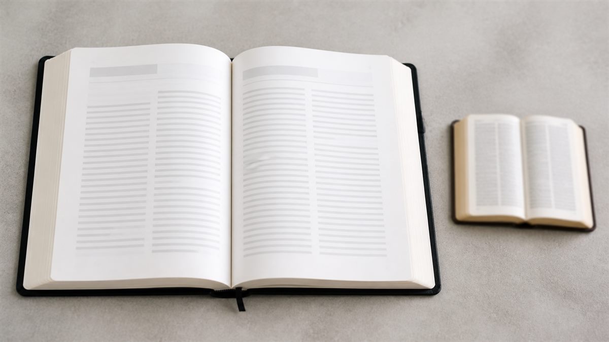
Look beyond the cover label
Compare the actual type sample, point size where supplied, and the amount of text on each page. A meaningful increase in type can be offset by crowded lines or narrow margins.
Separate large, giant, and super-giant claims
Terms such as large, giant, and super giant print are not always used identically by every publisher. Treat them as a starting point for comparison, not a substitute for seeing the specification.
Key Takeaway: Confirm the type sample and page design before relying on a large-print label.
Why Do Readers Choose Larger Bible Type?
Larger type can make the text easier to distinguish and can support more comfortable reading sessions. It is useful for readers who find small type tiring, prefer a less dense page, or regularly read Scripture for study, teaching, or devotion.

Comfort supports concentration
When readers can follow the page without repeatedly adjusting their position or lighting, attention can stay on the text and notes rather than the effort of deciphering the page.
Reader needs are varied
Age is only one consideration. Reading distance, lighting, personal preference, and the length of a typical reading session can all affect the most suitable format.
Key Takeaway: Choose larger type for the reading experience it creates, not for an assumed reader category.
How Should You Compare Holy Bible Large Print Type?
Compare type by reading a representative spread, not just the title page. Look at ordinary body text, verse numbers, headings, footnotes, cross-references, and any study material, because each element can affect practical legibility.
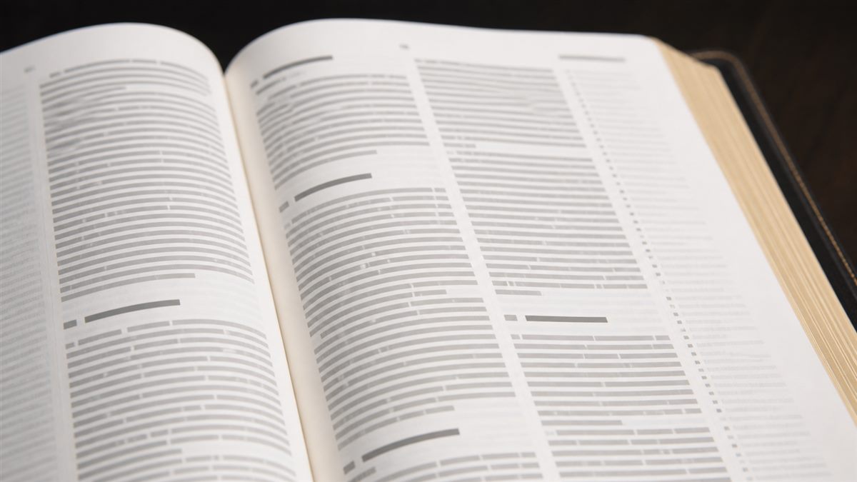
Review the smallest important text
A readable main text is important, but small notes can still become difficult to use. Decide whether references and supplementary material are central to the reader’s purpose.
Test with realistic reading conditions
Where possible, view a page under the lighting and at the distance used for normal reading. A quick visual check is more useful than selecting purely by a category name.
Key Takeaway: The most useful type size is the one that stays clear across the parts of the Bible the reader actually uses.
Which Page Layout Choices Improve Readability?
Type size works together with line spacing, column arrangement, margins, headings, and contrast. A page with balanced spacing can feel calmer to read than one that simply enlarges the letters while keeping every other element dense.
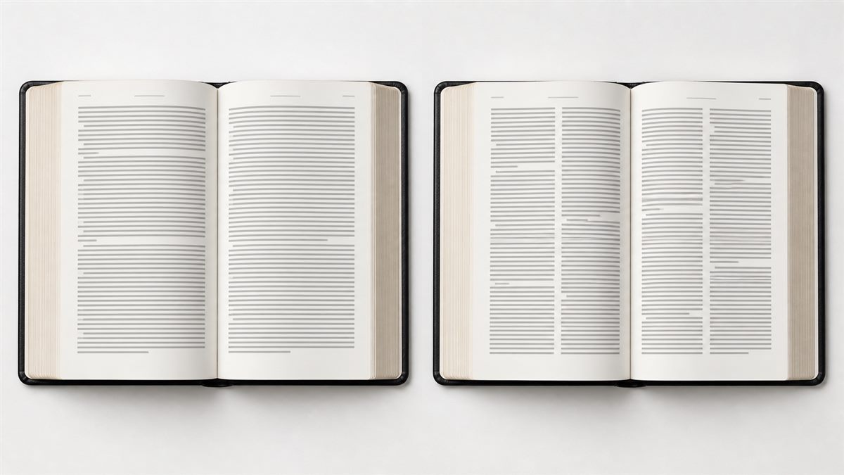
Compare single- and double-column pages
Some readers prefer the shorter line length of two columns; others prefer the uninterrupted flow of one column. Neither is universally better, so a representative page view is valuable.
Check navigation elements
Chapter numbers, running heads, page numbers, references, and section headings should be visible without overpowering the Scripture text.
Key Takeaway: Readability comes from the whole page system, not only the main font size.
How Does Translation Choice Affect the Edition?
Translation remains a primary decision. Once the preferred translation is clear, compare which large-print formats are available and whether their layout, references, and editorial features support the intended audience.
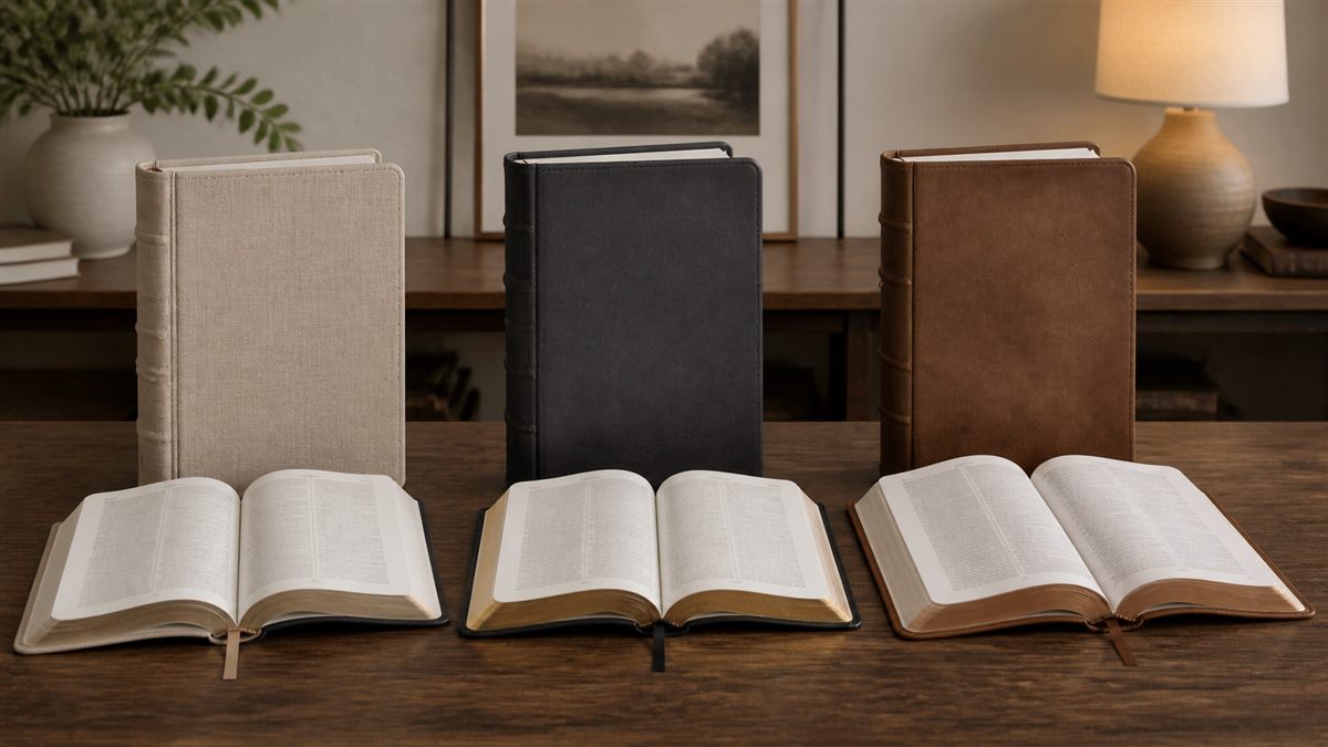
Start with the reader’s established use
A congregation, ministry, or individual may already use a particular translation for worship, teaching, or study. The readable format should support that use rather than force an unrelated choice.
Match features to the reading purpose
Consider whether the edition is for continuous reading, study, public use, gifting, or a specialized audience. Each purpose may call for a different balance of notes, references, and visual simplicity.
Key Takeaway: Select translation and edition features together, then compare readable-format options.
What Are the Size and Portability Trade-Offs?
Larger type often requires more page space, which can affect the book’s thickness, footprint, and weight. A format that is excellent for a desk or home study may be less convenient for travel, church use, or frequent carrying.

Plan around the actual use setting
For home reading, a larger format may be welcome. For commuting or travel, readers may prefer a slimmer edition that still offers enough type clarity.
Balance readability with handling
Check how the book opens in the hand, sits on a lectern or table, and fits into its intended bag or storage location. Comfort includes handling as well as seeing the text.
Key Takeaway: The best size is the one a reader can use comfortably where reading actually happens.
Which Binding and Cover Details Should You Consider?
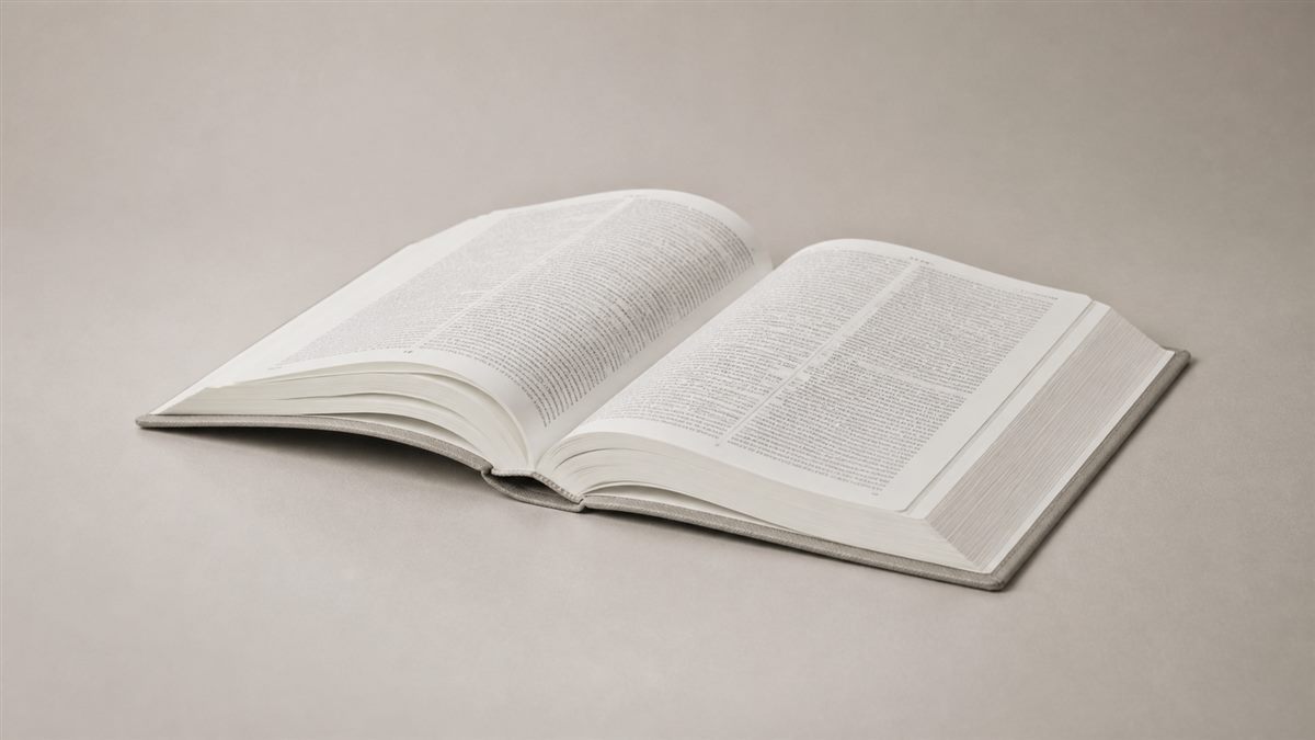
Binding and cover choices influence how an edition opens, handles, and presents. For a custom project, these choices should be reviewed alongside page count, trim size, paper selection, and the intended use—not chosen as isolated decorative details.
Prioritize usable opening behavior
A reader should be able to place the book open at a passage without fighting the format. The appropriate binding approach depends on the final specification and needs project-level confirmation.
Make the cover suit the audience
Cover appearance, texture, and durability expectations should suit the edition’s role, whether it is designed for regular personal use, gifting, or a ministry program.
Key Takeaway: Treat binding, cover, and interior format as one reading experience.
How Can Publishers Plan a Readable Bible Edition?
Publishers and ministries should begin with a clear reader brief: preferred translation, audience needs, visual hierarchy, trim direction, reference content, and intended distribution. For production context, explore King Tai’s Scripture publishing solutions.

Define the non-negotiables first
Record the desired reading experience before selecting decorative details. This helps the team evaluate type, spacing, paper direction, binding requirements, and cover treatment against a single purpose.
Keep production decisions connected
King Tai can support Bible printing projects across paper selection, printing, surface finishing, assembly, quality inspection, and logistics support according to the confirmed project brief.
Key Takeaway: A readable edition begins with an audience brief that links editorial design to physical production.
Why Is a Holy Bible Large Print Sample Important?
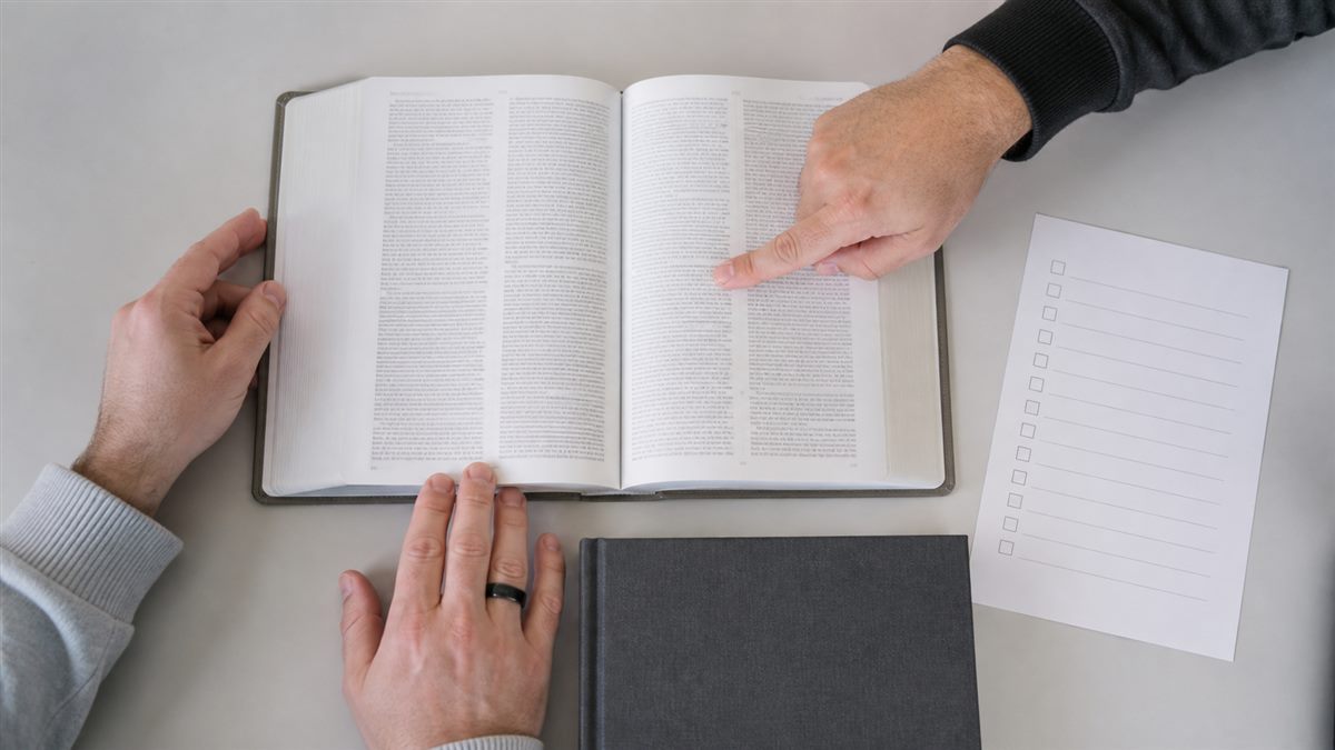
A production sample helps the team judge the finished reading experience before production decisions are locked. It allows review of type appearance, page balance, cover presentation, and physical handling in one object rather than in separate files.
Review the reader’s full journey
Check an opening spread, the smallest reference text, page turn behavior, cover feel, and the legibility of printing. Log open questions so the approved specification is clear.
Use approval as a production reference
King Tai’s quality approach uses the approved pre-production sample as an important reference for mass-production consistency. It does not mean every unit can be claimed to be identical.
Key Takeaway: A sample is the practical point where readable design and manufacturable details meet.
What Should You Ask a Bible Printing Supplier?
Ask questions that turn the intended edition into a clear production brief. King Tai’s printing services provide broader B2B context, while a Bible project needs its own confirmed requirements.
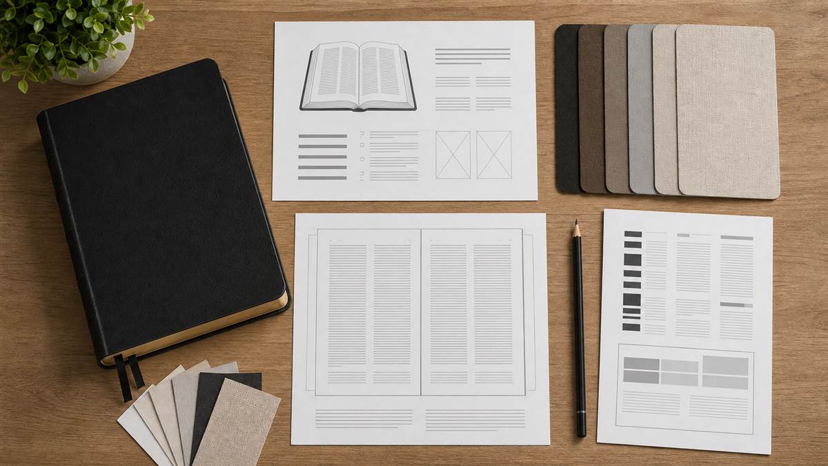
Prepare a decision-ready brief
- Preferred translation and confirmed content files
- Target reader and reading environment
- Trim size, type direction, and layout priorities
- Binding and cover direction
- Sample-review checkpoints and distribution needs
Confirm project-specific commercial details
MOQ, sampling time, production lead time, and final pricing depend on the final specification, quantity, materials, and finishing requirements. These points require project-specific confirmation. For an example of project development context, see this Bible printing case study.
Key Takeaway: Clear source files and reader priorities enable a more useful supplier discussion.
FAQ
What point size is considered large print in a Bible?
There is no single universal definition. Check the stated point size and a representative page sample, because publishers may use large-print labels differently.
Is a holy bible large print edition always heavier?
Often it can be larger or heavier because readable type needs more page space, but the final size also depends on trim dimensions, paper, content, binding, and cover choices.
Is single-column or double-column layout easier to read?
It depends on the reader. Compare a page sample in both formats and choose the line length, spacing, and navigation style that feels most comfortable.
Can a publisher customize a large-print Bible?
Yes. A custom project can consider layout direction, trim size, paper selection, printing, surface finishing, binding, and cover presentation, subject to the final confirmed specification.
A readable Bible edition is a considered combination of type, layout, physical format, and the needs of its reader. For a custom publishing project, King Tai can help move a confirmed brief through printing and production support. Talk with our team about your project requirements.