
The best paper for book printing depends on what readers will do with the pages. Uncoated stock is a sensible starting point for long passages and writing. Coated stock deserves comparison when photographs and detailed color carry the book. A high-page-count Bible needs a different balance of thinness, opacity, strength, and printability.
Choosing from a swatch alone leaves several decisions unresolved. Paper that feels substantial in your hand can make a thick book difficult to open. A beautiful image proof may hide distracting show-through on the reverse. Before accepting a quotation, compare the paper in the intended format, with representative artwork and the proposed binding.
Which paper should you shortlist for your book?
Shortlist paper by the interior’s main job: sustained reading, image reproduction, annotation, or compact reference use. These needs lead to different starting points, even when two projects share the same trim size.
| Book or use | Starting paper choice | Main trade-off to check |
|---|---|---|
| Novel or text-heavy nonfiction | White or cream uncoated book paper | Reading appearance versus opacity and finished bulk |
| Photography, art, or illustrated reference | Coated gloss, silk, or matte text stock | Image detail versus reflections, weight, and page stiffness |
| Workbook, journal, or activity book | Writable uncoated stock | Pen behavior versus show-through and cost |
| Bible or very long reference title | Specialty thin printing paper | Compactness versus opacity, handling, and process limits |
| Mixed text with a short photo section | One qualified stock or separately planned inserts | Consistent appearance versus extra production steps |
The table gives a shortlist, not a finished specification. A designer may deliberately prefer the muted appearance of images on uncoated paper. A manual with dense diagrams may need a smooth white sheet even though most pages contain text.
Send two or three representative spreads with a request for custom printing services. Include the page with the darkest image and the page with the smallest type. Those files help the printer suggest grades that address the real content instead of quoting an undefined “premium paper.”
What do GSM, pounds, and caliper tell you?
GSM describes paper mass per square meter, while caliper describes one sheet’s thickness. US pound weights require the paper category and its basic sheet size to make a useful comparison.
| Specification | What it describes | What to ask the supplier |
|---|---|---|
| GSM | Mass per unit area | What is the specified weight of this exact grade? |
| US lb or basis weight | Ream weight at a category’s basic size | Is this text, cover, bond, or another basis? |
| Caliper | Thickness of one sheet | What thickness should the spine calculation use? |
| Bulk | Thickness relative to weight | Does the grade create the desired body without excess mass? |
| Opacity | Resistance to light transmission | How does reverse-side printing look on the proposed stock? |
An “80 lb” quotation is incomplete without its category. Text and cover papers use different basic sizes, so the same pound value does not describe the same sheet. Ask for GSM alongside the full grade description when comparing international quotations.
Two stocks with the same GSM can also have different calipers. Keep the supplier’s grade name or product code attached to the sample and quote. That identification becomes useful when a substitute appears later: matching weight alone does not establish equivalent thickness, shade, or surface.
Should you choose coated or uncoated paper?
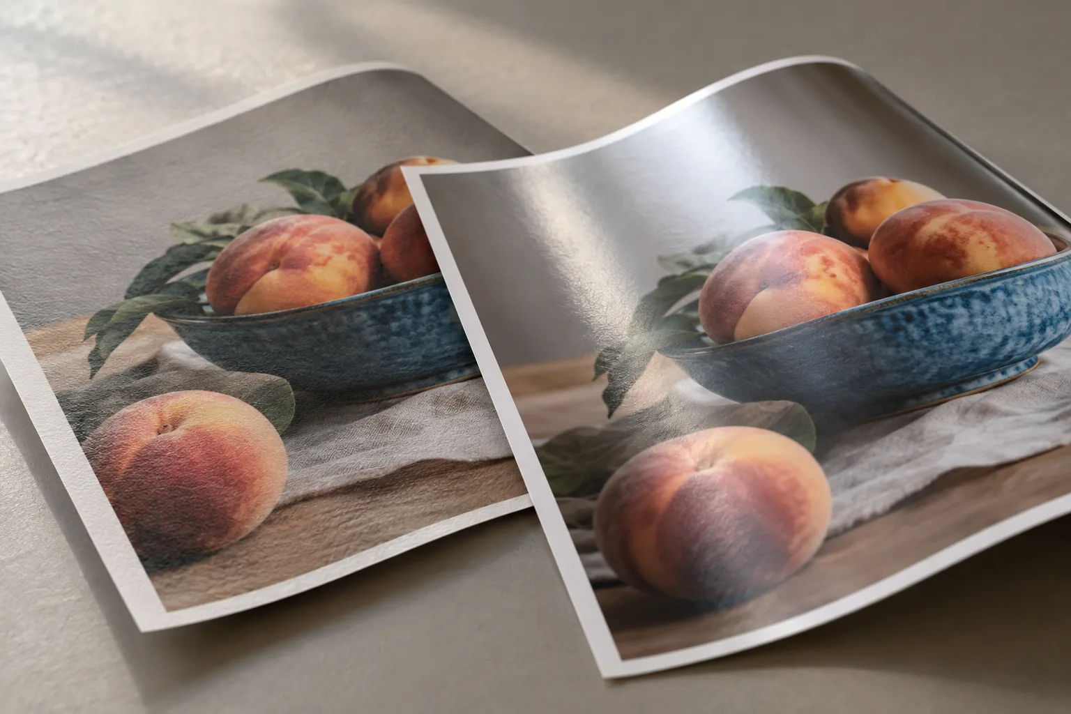
Coated paper is often the stronger starting point for crisp photographic detail, while uncoated paper suits a softer image character and a surface intended for writing. Neither category fixes the appearance on its own; smoothness and the exact grade still matter.
When images carry the book
A coating limits ink absorption and helps retain defined printed dots. Gloss, silk, and matte finishes offer different surface reflections. In an art publication, compare fine detail, shadow separation, pale tones, and reflections across a full spread. A small crop cannot show how a large area behaves under room lighting.
For art and collection books, proof the same image file on the shortlisted papers. Ask the printer to identify any color-management changes between the proofs. Otherwise, a difference caused by press settings may look like a paper advantage.
When text and touch carry the book
Uncoated paper can suit a quiet, tactile design, including some illustrated books. However, a rougher surface may soften detail or make a large solid area less even. Choose the stock with the intended image treatment in mind.
The paper manufacturer’s coated and uncoated paper guidance explains the surface and ink behavior behind these choices. Use that distinction to plan a comparison, then approve the actual printed result.
Is white or cream paper better for your pages?
White paper is usually a practical starting point when neutral images, diagrams, or clear color distinctions matter. Cream paper creates a warmer page and is worth comparing for a text-led reading experience.
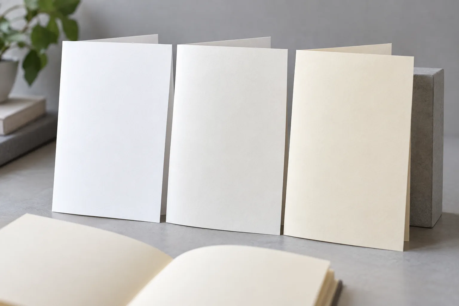
Shade and surface gloss are separate choices. A cream sheet is not automatically glare-free, and a white sheet need not be glossy. View the samples under the lighting readers are likely to use. Ask several reviewers to read a full page rather than choose from a color chip.
Paper shade also contributes to printed color. Check pale backgrounds, neutral grays, skin tones, and image highlights on the selected stock. A file approved on bright white paper may look warmer on cream, even if the ink values remain unchanged.
Record shade with the paper grade, not only with a broad label such as “ivory.” For a series, place the new printed sample next to the retained sample from the previous edition. Agree which differences require approval before the supplier changes stock.
How much show-through is acceptable?
Acceptable show-through depends on the artwork and the reading task, so assess opacity with printing on both sides. Reverse-side photographs may distract more than light text, especially behind small type or a pale illustration.
Show-through is the visibility of the reverse image through the sheet. Ink penetrating the paper is a different problem. A weight increase does not, by itself, prove that either issue has been solved. Paper structure, surface treatment, ink coverage, and the printing process all deserve attention.
For a useful check, request a two-sided sample containing a dark solid area, a dense text page, and a light page facing demanding reverse-side content. Inspect it in normal reading light with the rest of the book beneath it. Holding one sheet against a lamp exaggerates an effect the reader may never see in use.
Where compactness is important, Bible paper selection requires a particularly careful opacity discussion. Agree on a printed reference sample and what constitutes unacceptable distraction. A supplier’s opacity figure is useful, but it cannot replace reviewing your layout.
Key Takeaway: Approve show-through using the most demanding two-sided spread in the book. That gives production a clearer target than a request for “thicker paper.”
How do page count and binding change the choice?
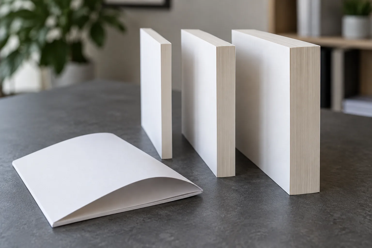
Page count multiplies the effect of caliper, while binding determines how the resulting block folds, opens, and attaches to the cover. Choose these together before the printer releases final cover dimensions.
A simple bulk calculation
For a conventional book printed on both sides, 400 interior pages equal 200 leaves. As an illustration, a 0.10 mm sheet gives a paper-stack estimate of 200 × 0.10 = 20 mm. At 0.075 mm, the same pagination gives 15 mm. The difference is 5 mm before allowances for binding, endpapers, inserts, and production variation.
These are hypothetical calipers, not recommended grades or final spine dimensions. Ask the printer to calculate the actual spine and confirm it with a dummy. A late paper substitution can affect the cover file, slipcase fit, carton layout, and finished weight at the same time.
Grain and mixed stocks
For many book constructions, grain parallel to the binding edge supports folding and opening. The printer should confirm grain within the actual sheet layout and signature plan. A grain-long label on the parent sheet is not enough without knowing how the pages will be imposed and cut.
Compare the proposed paper with the intended book binding method. If photo inserts use another stock, specify their page count and position. A change in stiffness at an insert can alter how the book opens, so include it in the bound sample.
Why do Bibles need a separate paper decision?
Bibles and other very long reference books often need specialty thin paper to control the size and weight of the text block. The choice must balance opacity with page handling, folding, and print quality at a low sheet thickness.
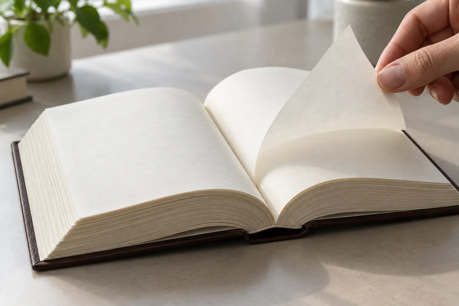
Ordinary book-paper recommendations cannot be transferred directly to this work. Adding thickness across a large number of leaves can create a much bulkier product. Conversely, selecting the thinnest available stock may leave the reader with distracting show-through or pages that are awkward to turn.
Start the custom Bible printing discussion with trim size, pagination, type size, ink colors, coverage, binding, and intended use. A compact travel edition and a large desk reference do not need the same compromise.
Ask the supplier to confirm which thin-paper grades its proposed press and binding route can handle. Request a printed, folded, and bound sample using the actual layout. If readers will annotate the margins, test the intended writing tools separately; printing performance does not establish pen compatibility.
Maps, reference inserts, tabs, and endpapers should also appear in the sample specification. Those parts can use different papers, but the complete book must still open and close as intended.
Will the paper suit the press and intended use?
Paper must suit the selected printing process and the reader’s use. An offset grade, dry-toner grade, and inkjet grade can share a similar weight while needing different surface properties or production settings.
Confirm the production route
Ask whether the proposed sample uses the intended production process. A digital proof may establish layout and text accuracy without proving the behavior of the final offset stock. If it uses substitute paper, record which decisions remain open.
Check the intended stock for feeding, ink or toner adhesion, drying, folding, and rubbing after print. The printer should choose the test method for its process. Avoid accepting “works on digital” as confirmation for an unidentified device and paper grade.
Test the reader’s actions
For notebooks and journals, try representative pencils and pens on the printed sample. Look at drying, smearing, feathering, and marks visible from the reverse. Coating names alone cannot predict the result for every writing tool.
In children’s book production, page stiffness and ease of turning may matter as much as image appearance. Confirm the intended format and age-related product requirements with the supplier. A heavier sheet does not automatically replace the structure of a board book.
What should you approve before accepting the quote?
Approve a defined paper grade and a sample plan, then compare the cost of the finished books. The cheapest sheet can lose its advantage if it requires a different format, extra processing, or more costly packing.
Give each supplier the same trim, pagination, quantity, color plan, binding, and delivery destination. Request an alternative paper only if it solves a clear problem such as excess bulk or distracting show-through. Ask how that substitution changes the total quotation and which proofs need repeating.
| Approval item | Evidence to request | Decision it supports |
|---|---|---|
| Paper identity | Grade, GSM, caliper, shade, finish, and availability | Comparable quotes and controlled substitutions |
| Printed appearance | Demanding two-sided spreads on actual stock | Color, small type, show-through, and surface behavior |
| Book construction | Full-size bound dummy with planned inserts | Opening, bulk, spine dimensions, and handling |
| Production acceptance | Agreed sample and documented checks | A repeatable reference for the production run |
| Delivered cost | Packing quantities, shipment weight, and quote assumptions | Comparison beyond the price of paper |
Supply the pages that need writing, dense color, or frequent handling when you request a paper and printing quotation. Ask the team to list what the sample proves and what it cannot establish. A blank dummy, layout proof, and printed production sample each answer different questions.
Key Takeaway: Keep paper substitutions subject to approval. Even a stock with the same GSM can change color, bulk, opening, or writing performance.
How do you make the final paper choice?
Choose the paper that meets the book’s reading, image, handling, and production requirements at an acceptable finished cost. Use the application to narrow the field, then let the actual printed and bound samples resolve the remaining trade-offs.
Kingtai can help review materials, binding, finishing, and packing for custom books and publishing projects. Send your page files or representative spreads, trim, page count, quantity, and preferred paper direction to Kingtai Printing & Packaging. Ask for a named stock recommendation, one relevant alternative, and a sample plan before approving production.
Can I use ordinary office paper for a professionally printed book?
It may work for a prototype or a compatible short-run process, but an office-paper label does not specify the book’s opacity, bulk, grain, or binding behavior. Let the printer qualify the exact grade for production.
Does a higher GSM always mean less show-through?
No. Weight can help within a paper family, but opacity also depends on the grade’s composition and structure. Compare the supplier’s data and a two-sided printed sample rather than assuming equivalent performance across brands or grades.
Can text pages and photo inserts use different papers?
Yes, if the printer plans the gathering and binding around them. Specify the insert count and location early, and include them in the bound sample because they change cost, stiffness, and sometimes spine thickness.
Does cream paper guarantee easier reading?
No. Readers differ, and type size, contrast, surface reflections, layout, and lighting all influence comfort. Compare a full reading spread on the shortlisted white and cream grades with the intended audience.
When should I finalize the cover’s spine width?
After pagination, paper, inserts, and binding are sufficiently fixed for the printer to issue a cover template. Reconfirm the spine if any of those inputs change before production.